It was fitting that I went to see Chateau Soleil on a sunny virtually cloudless day, after all, the homes moniker means “house of the sun.” It was even painted a soft buttery yellow, welcoming visitors into this grand estate located in a tony area of North Atlanta. Built in 1998 on two very lush acres of prime real estate this 14,000 square foot home was designed by renowned architect William T. Baker. It was a magical moment when I walked through the front door and into this well-heeled home created by 27 of Atlanta’s multi-talented designers. Featuring six bedrooms, seven baths, and expansive hallways this abode featured showstopping designs paying homage styles from French classicism to the timeless elegance and an updated riff of the Pauline de Rothschild’s chinoiserie room.
Of course, I am always “late to the party” and because I was the last one through the house I missed the kitchen, dining & breakfast room. It wasn’t until I was well on my way back to the suburbs that I realized I missed an entire portion of the stately home. Do I see a return visit in my future? Perhaps. Because I took over 200 pictures, I decided to make this a three part series. If you don’t live in the Atlanta area, there is a lot to share and undoubtedly inspire you to live a beautiful life, regardless of your budget.
While it may seem unattainable for most of us, show-houses are created to inspire and make us dream of the possibilities. Whether you are moved by a color scheme, woodwork, wallpaper or fabrics- inspiration is all around you, in every nook and cranny. You just have to look.
So let’s start with the first floor and the showstopping rooms of Parker Kennedy, Michel Boyd & Robert Brown.
Designer/ Parker Kennedy-Photo/Vicki Gladle Bolick
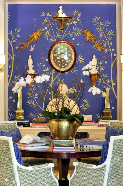
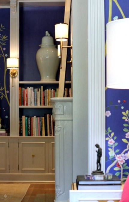
With hand-painted walls in vibrant colors and gold accents this room is an updated riff on classic design.
Designers/ Parker Kennedy-Photo/ Vicki Gladle Bolick
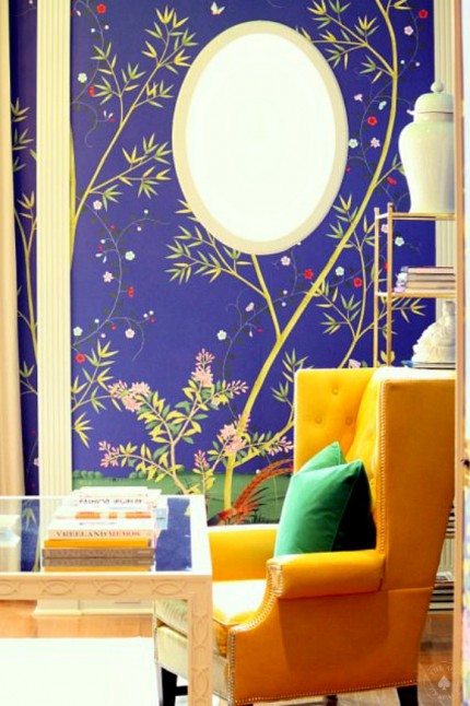
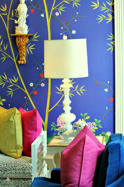
This room is proof that we should all embrace color, the wall treatment provides the springboard for the color palette.
Designers/ Parker Kennedy-Photo/ Vicki Gladle Bolick
“We want to bring a fresh look to a traditional room in this 2015 show-house–a classic, updated fresh design.”-Lance Jackson & David Ecton
Designers/ Parker Kennedy-Photo/ Vicki Gladle Bolick
It’s all about the details…
Designers/ Parker Kennedy-Photo/ Vicki Gladle Bolick
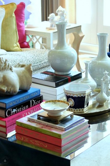
The perfect recipe for a tables-cape….
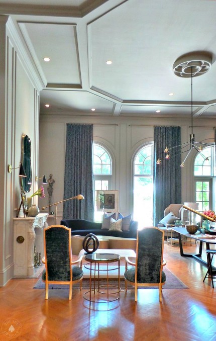
Designer/ Michel Boyd-SmithBoyd Interiors-Photo/ Vicki Gladle Bolick
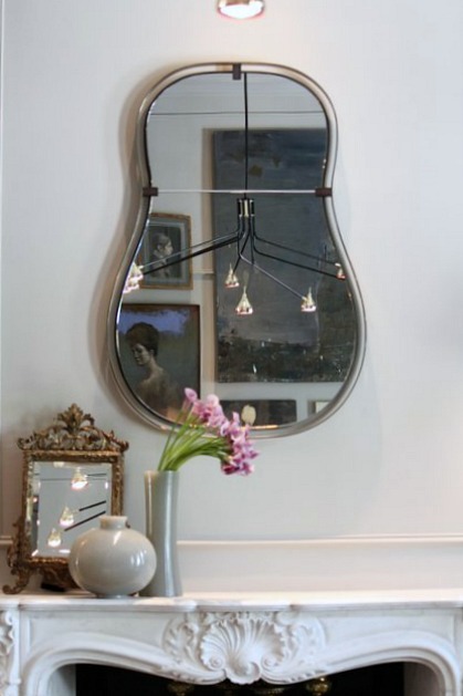
A mantel top vignette, and reflections of a stunning chandelier…
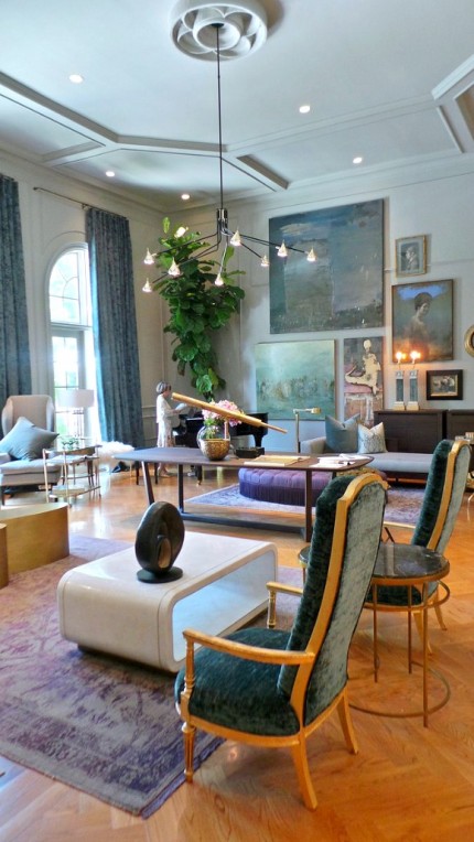
Designer/ Michel Boyd-SmithBoyd Interiors-Photo/ Vicki Gladle Bolick
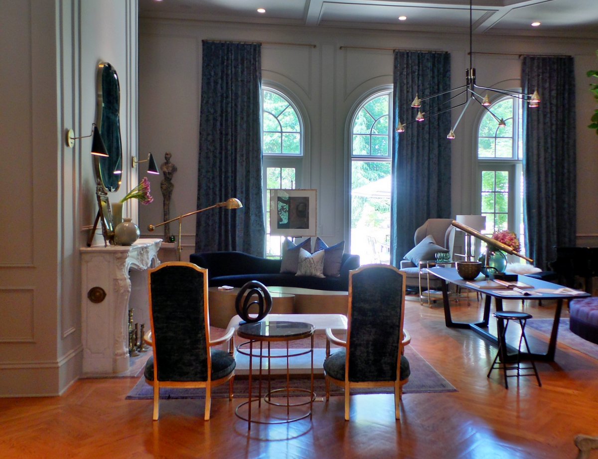
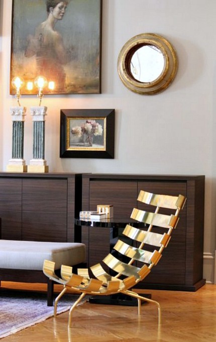
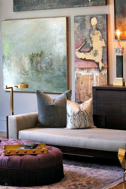
Gold is hot, and so is this room design. I love the carefully curated wall of art, mixing traditional with modern furnishings.
Designer/ Michel Boyd-SmithBoyd Interiors-Photo/ Vicki Gladle Bolick
Rich textures & modern lines give this eclectic space a luxurious and classic feel.
Design/ Michel Boyd-SmithBoyd Interiors-Photo/ Vicki Gladle Bolick
“I’d like for the formal space to feel romantic and luxurious, but also a ‘lightness’ inspired by architecture…”-Michel Boyd
Designer/ Michel Boyd-SmithBoyd Interiors-Photo/ Vicki Gladle Bolick
I think this room epitomizes Michel’s designs which define “sexy glamour.”
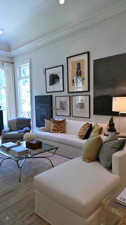
Designer/ Robert Brown-Photo/ Vicki Gladle Bolick
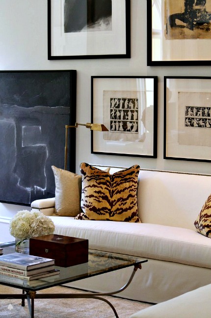
Robert’s design was inspired by one of his favorite hotels in Paris. A blend of traditional with contemporary pieces. Of course, a little leopard always adds a touch of the exotic.
Designer/ Robert Brown-Photo/ Vicki Gladle Bolick
Classic elements and modern art makes this room feel “collected and interesting.”
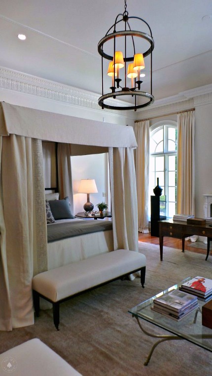
Designer/ Robert Brown-Photo/ Vicki Gladle Bolick
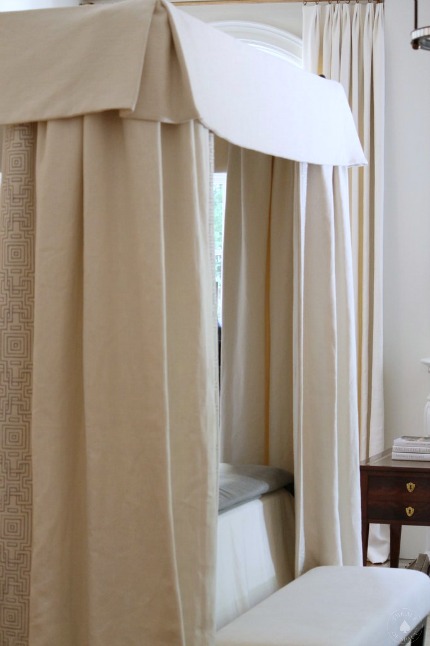
Let’s talk about this fabulous & luxurious canopy bed. It’s sophisticated and elegant…giving this room a light and airy feel.
Designer/ Robert Brown-Photo/ Vicki Gladle Bolick
A close-up of the canopy detail.
 Designer/ Robert Brown-Photo/ Vicki Gladle Bolick
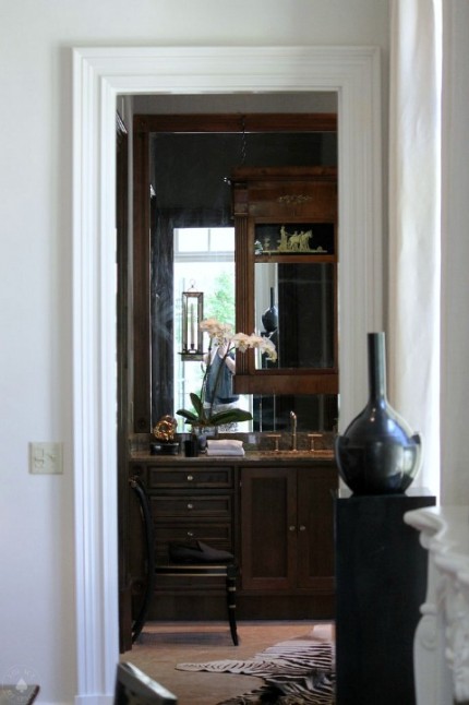
Robert wanted the master-bath bathroom to feel like a gentleman’s library “grey flannel walls accented with contemporary art flow beautifully from the master bedroom…”-Robert Brown
I hope you enjoyed Part I of the tour, there is so much more to share so check back often. Remember inspiration is everywhere…
Also, all the proceeds from the Decorators’ Showhouse & Gardens go to support the ASO and it’s community outreach and educational programs. The house is open until May 10. For more information about where to purchase tickets you can visit www.decoratorsshowhouse.org
As always don’t forget to follow us on Social Media for more design and happenings…
https://facebook.com/theaceofspaceblog
http://pinterest.com/bolickinteriors/
http://instagram.com/theaceofspaceblog.com
https://twitter.com/theaceofspacebl
Until next time,
BE INSPIRED. BE AMAZED.

