What a crazy week, finishing up a few projects starting a few new ones, and trying to slowly make my way back into the Atlanta “Design Scene” (after a much need break) and the most important reason, my daughter. I have to share this little tidbit because we all need to laugh at ourselves, and if anyone can laugh at herself that would be moi’. Last week, I attended a design related event (I changed a few details to protect the innocent, namely me). It was a cocktail party with a dinner that followed, and I was so bored that I watched funny YouTube videos under the table (check this one out) http://youtu.be/XQcVllWpwGs I would like to state for the record that the video in question was sent to me by a like minded friend seated the other end. So as luck would have it, I forgot to turn the sound down on the latest Evian video featuring animated roller-skating babies. To make matters worse and in a feeble attempt to turn it off, I actually turned it up. Now that was a way to get attention. Yup, the conversations stopped and all eyes were on me. I want to mention that I am a proponent of good manners, but I was sandwiched in between two women who lost me after “hello.” Yup, there is nothing that loses my interest more than overinflated egos.
So after sharing my latest social “faux pas”, onto design I go…I recently took on a client that loves rustic paired with modern. She didn’t know it, but through some lengthy meetings and having her pull a lot of pictures, I was able to define her taste, “Rustic/Modern.” It’s going to be a really fun departure, as a designer I appreciate all styles of design, but sometimes we get “pigeon-holed” and this client is going to be a breath of fresh air. They are young, hip, and I so love the fact that I am helping them define a style that really showcases how they live and reflects who they are. These were some of the pics I showed her that she loves, and quite frankly so do I (Mr. B don’t worry I’ll wait until our next house). So here are some amazing interiors featuring “Rustic/Modern”…
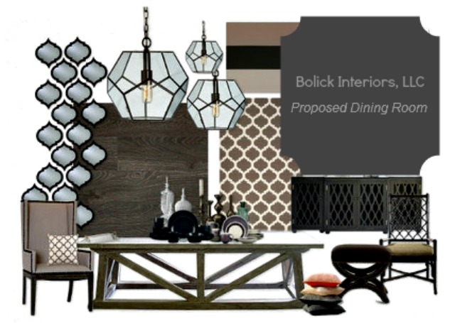
These are some of the proposed design elements for my young clients which fit in perfectly with their Rustic/Modern sensibilities. To balance out the neutrals, we’ll be adding some warm orange tones in the accessories and pillows.
Via Vicki Bolick/Bolick Interiors
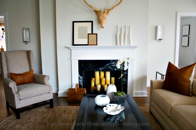
This interior was part of a design for a young, hip & urban news reporter for CNN. We incorporated transitional furnishings with some subtle, rustic elements as homage to his Brazilian heritage.
via adoreyourstyle.com
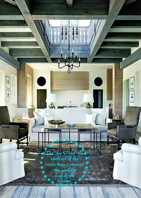
Now this is the pure definition of Rustic/Modern, and the picture that my client was just swooning over. I love the rustic vs. modern pairing, and the mixing of woods.
via style@home.com
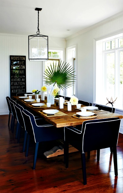
I adore the rustic table softened by the modern velvet chairs in a scrumptious shade of cobalt blue.
via style@home
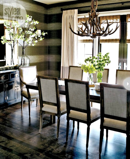
This takes Modern/Rustic to a new level. From the subtle stripes in the wall-covering mimicking “chink style” stacked logs, to the natural materials mixed with artful pieces. The modern table is the perfect juxtaposition to the subtle rusticality of the room.
via decorpad.com
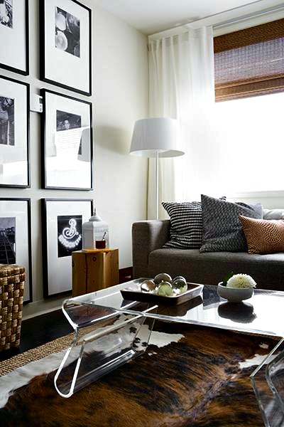
Okay, let’s face it, the Lucite table is an absolute stunner. This space is perfectly layered in texture, fused with rustic and modern pieces.
via style@home.com
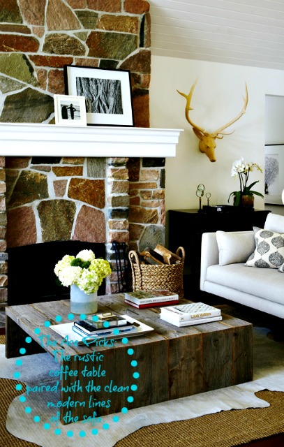
The cocktail table is just Modern/Rustic perfection.
via Kelly Deck
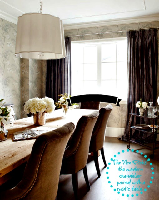
The hard lines of the rustic table are softened by the gentle curves of the velvet chairs, with a subtle graphic wallpaper as the perfect backdrop. I am totally smitten…
Cheerio!
Don’t forget to visit my Pinboards on Pinterest for more design inspiration…

