I promised in my last blog that I would somehow “divide and conquer” the Coverings show that I attended several weeks ago into three installments (this is Part II). Of course, I was ready to do that two Monday’s ago, when two very large Fed-Ex boxes showed up at my front door full of material that I greedily scooped up from the press room. Lesson learned: Just because something is free doesn’t mean you have to take it…(unless it’s major swag). So I spent the best part of two days just going through magazines and photos that I snapped to find the best of show from the North American companies represented at Coverings.
P.S. Once again it’s been 2 weeks since my last blog post and I’m about as horrified as I was when I got our last credit card statement (Yup, I fell victim to some serious retail therapy). I do want you to know that there is a very good reason. We are hopefully close to realizing a dream of ours. I wish I could say more. But, I do want to send a special “shout out” to our amazing friends who have been there for us, and have been beyond supportive (and have our backs no matter what). Okay, I’m getting teary just thinking about it…so please continue to keep us in your prayers.
Anyway, I hope you enjoy my picks from some of the North American companies that attended Coverings (www.coverings.com). The first one that caught my eye was Sabine Hill (I adore the name), which just released their new collection of handmade cement tile and natural stone. It was started by Lyndsey Glasener from Lake Forest, Ill., mother of two, who not only designed the tile (Are you kidding me? I can barely get out one blog post), but the website and the catalog. Sadly, I didn’t get the opportunity to meet this one woman powerhouse. So Lyndsey, my hats off to you and a big clink, clink of the champagne glass because your product is just beyond. They are a relatively new company, but I would bet that they are going to have a banner year and you’ll soon see why…(www.sabinehill.com).
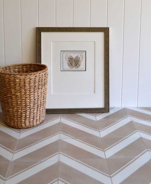
Are you in love yet? This is from the “Tilt” collection.
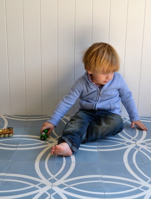
I do want to mention all the lines come in different colorways and they all are just stunning. This slice of heaven is “Float” in Colorway 3…
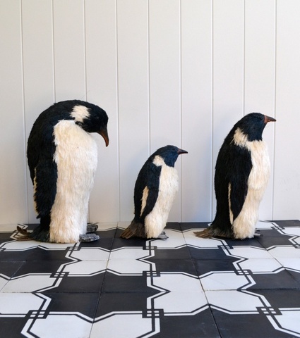
Called “Lace” this tile would be absolutely perfection in a hallway…(Cute Penguins not included).
Next on my list, is a company called Artistic Tile located in N.J., of which, really showcased some innovative designs in glass, mixed material, and stone. There is just not enough space to show all their products so visit www.artistictile.com to see more of their fabulousness. Here is just a small sampling of some interiors that used Artistic Tile, proving pictures do in fact speak louder than words.
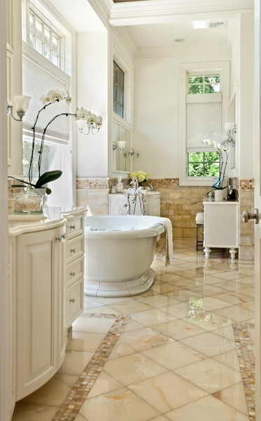
Designed by Nancy Epstein; CEO and Founder, who used Bianco Onyx in this bath. I love the creamy white, translucent look of this tile with brown veining…
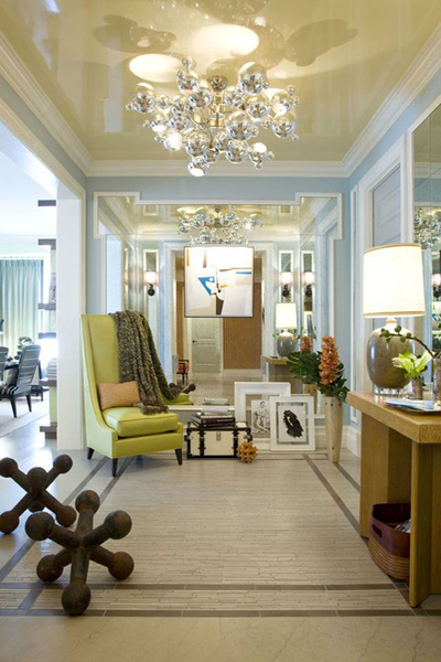
Designer John Willey of Willey Design used Smoke Limestone with a grey Faussano Border on the floor and it is simply spectacular…(P.S. Mr. B. I want to live here). Don’t you just adore the large sculptural homage to the childhood game of “Jacks” sitting on the floor?
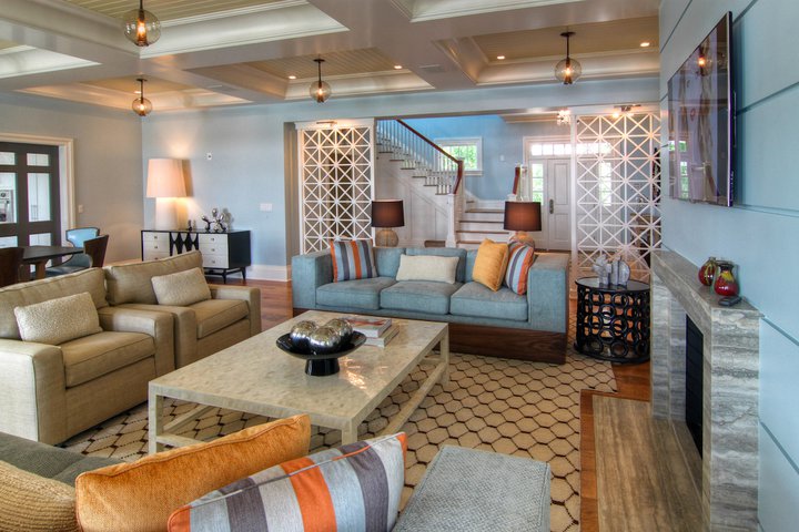
I really have to meet this guy, he could seriously be my new “design crush”. This room is also from Designer John Willey of Willey Design, and showcases Artistic Tile’s Ocean Blue-Travertine on the facade of the fireplace.
Next on my list of fav’s was Pratt and Larson, who had the most fabulous ceramics as evidenced by the photo’s below, plus they are located in one of my favorite cities in the Pacific Northwest, Portland Oregon. To see more of their unique and stunning collections visit (www.prattandlarson.com).
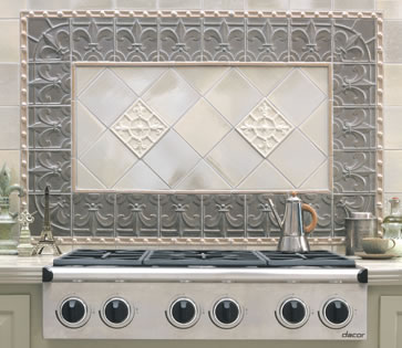
From their French Quarter Tile Collection…
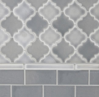
Loving the “Watercolor Grays”…
The tile from their “Arabesque” collection is just classical perfection, and would work just as well in a modern or period home…(P.S. I am absolutely infatuated with this pattern).
The Coverings event really opened up my baby blues to all the wall and flooring applications for tile, and Granada Tile had some spectacular products, so check out how they were used in real life applications by visiting www.granadatile.com. The owner, Marcos Cajina, is another success story who created his company out of his L.A. basement in 2001 (seriously, it’s totally inspiring to see people following their dreams).
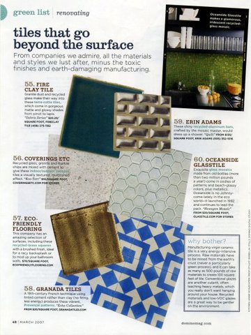 Number 58 is the tile used in the photo below, for those of you who may be vision challenged when it comes to smaller print like moi´.
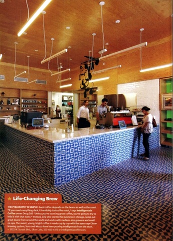
From Tihany Design out of New York for the Bouchon Bistro in Beverly Hills using the “Copenhagen” tile. So elegant and all so French….
I truly think this is the longest blog post ever…but one more honorable mention from the great U.S. of A. is Stonepeak out of Chicago, Illinois (http://www.stonepeak.com), which had so many showstopping tiles that I I lost count…
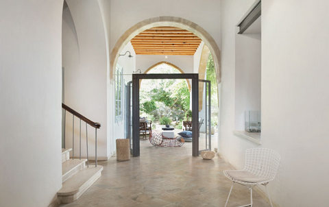
This spectacular hallway uses “Raj” tile which replicates the exotic slate found in India.
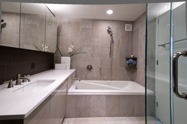
An installation at 215 Ave. B, N.Y., N.Y using Quartzite Lime. Now this is what I envision for our master-bath makeover…sleek, elegant and sophisticated.
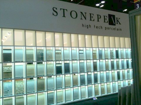
This was the Stonepeak display wall at Coverings in Orlando. Decisions…decisions…
I’m so glad that I was able to finish this post because I truly felt like a giddy school girl at the Coverings show, there was so much inspiration all around. It was a total swoon fest for all of those in attendance as part of the VIP Press Tour. I’ll be back to posting on a regular basis, and I just picked up two clients this week. They will be absolutely fun projects (one of which is a total house makeover), and I look forward to sharing the pics of our progress over the upcoming few months.
“The world is a book, and those who do not travel read only one page.” -Lyndsey Glasener
So be inspired and be amazing!!!!
Vicki “The Ace of Space”
Bolick Interiors, LLC

