Welcome to our new series. It’s all about crushes, well at least design crushes. Which is perfectly fine and cleared with Mr. B. So I had this (self-professed) brilliant idea awhile back, to feature my design crush, who then reveals his/or hers which starts a six degrees of separation of sorts. Indefinitely. Hmm…so who to feature? Because I have stalked, slightly pursued, and downright made a fool of myself in front of a few of those in the interiors world who have been on my radar. Should it be Thom Filicia (my homie from Upstate NY?) Martyn Lawrence Bullard who promised to record the incoming message on my voice-mail, only to have my phone die at the precise moment of {sic} recording? (Imagine that silky cultured British accented voice informing my callers that I am unavailable?). That’s something that I may never get over. Enter Brian Patrick Flynn, not only is he talented, but he has a very, very wicked sense of humour. For those of you who know me, I love to laugh a lot, and I happen to think that funny goes far in a world that often takes itself a little too seriously. He and I have met a few times, and unbeknownst to him we are “kindred spirits of comedy,” in fact his Instagram feed is one of my guilty pleasures. He provides my daily dose of hilarity. So meld it all with the fact that he is an American TV personality, known for such shows as TBS’s Movie and a Makeover, a multitude of collaborations with HGTV and you have an approachable, charming, well-respected interior designer who also created Flynnside Out Productions, a full-service production company (www.flynnsideout.com). A man of many, many hats, and a man whose rapier wit is truly unrivaled in my book. So a week or so ago I approached him via e-mail and his trusty assistant sent an e-mail back asking if I could get the questions to them ASAP before Brian Patrick Flynn went out on the road. There was a little scrambling on my end, but luckily the hot lava of genius flowed straight to my fast tying fingertips, and the rest is history. This interview wrote itself…or at least Brian Patrick Flynn did. P.S. I want to thank him from the bottom of my heart for being game at the last minute, and kicking off our series that is going to be great fun! So without further ado here is the man of the hour…  What inspired you to choose design as a career? The set design and decoration of Wes Anderson and Stanley Kubrick movies. I studied film and TV in college, and after falling in love with the art direction of A Clockwork Orange, Rushmore and The Royal Tenenbaums, I realized my favorite part of the industry was production design. I’m into spaces that have tons of personality, like pretty much every single room in a Wes Anderson film; however, I also like spaces that are streamlined with only a few sculptural and bold-colored elements, like 2001: A Space Odyssey. I consistently try to blend the two each time I approach a decorating or design project.
What was your “Oh my god I made it, AHA moment?“ Are you implying that I’ve actually made it? If so, well then, hot damn! I don’t know that I’ve made it just yet, but things are trucking along nicely nonetheless. I think my pseudo Aha! moment, thus far, was being asked to design a store window front for “Legends of LaCienega” in 2013. It’s a big who’s who of the West Coast design world, and being asked to join the likes of iconic designers like Thom Filicia, Mary McDonald, Molly Luetkemeyer and Jeff Andrews was pretty damn cool.
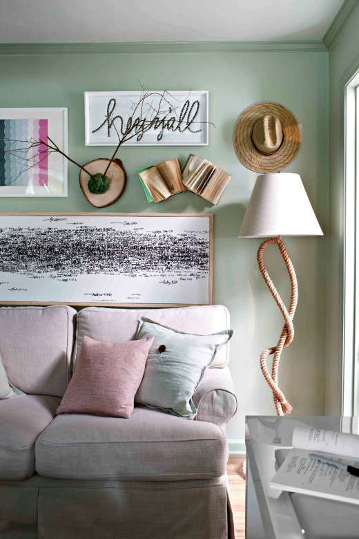
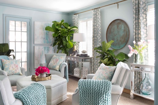
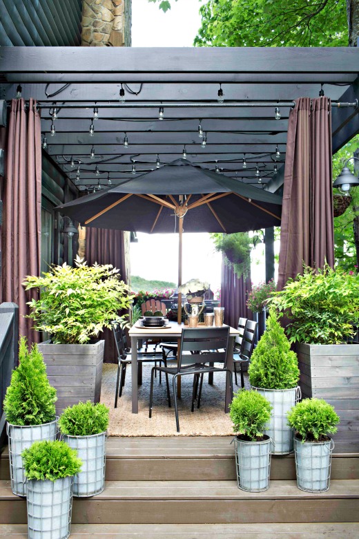
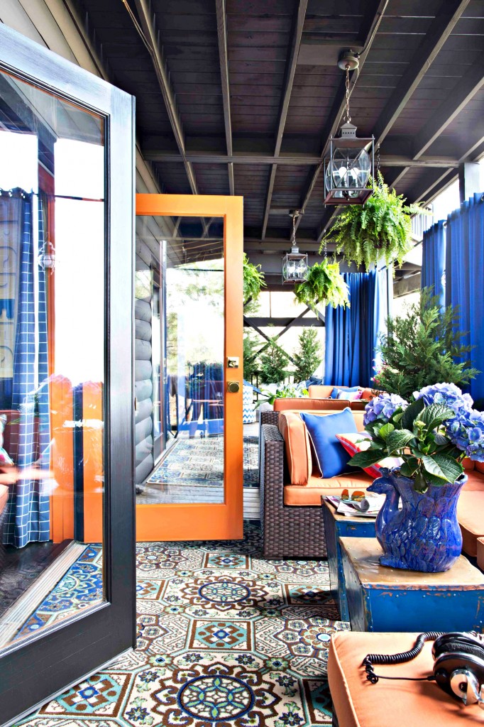
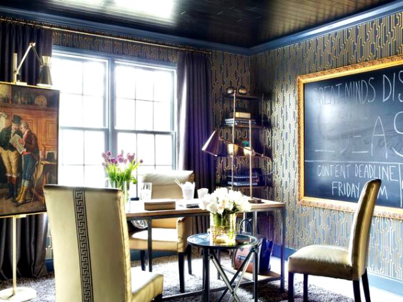
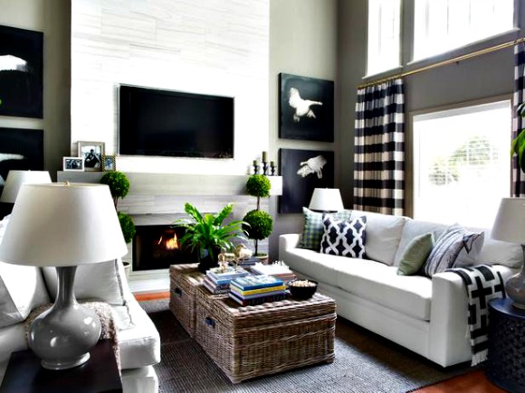
Favorite Project (television or private client? My favorite project I’ve designed for camera is HGTV Spring House, a show house-like digital series that’s both video and editorial based (http://www.hgtv.com/hgtv-spring-house-2014/videos/index.html). I stepped outside my usual masculine, dark aesthetic and instead tried my hand at muted color and feminine style to ensure the homeowner/client was happy, and I’m proud of how it turned out. As far as private clients are concerned, I’d say I’m most proud of the traditional Santa Barbara-inspired house on Mulholland Drive in the Hollywood Hills I designed for a much-celebrated Emmy-winning TV producer. She was a dream to work with, and we both have personal styles that gelled beautifully together.
Okay, the funniest moment when you were in front of the camera? I was hosting an event for HGTV in Orlando, and this father of two came up to me with his kids as I was still addressing the audience, and he told me how excited his daughters were to meet a famous chef and asked if I’d take a picture with them and offer them some culinary advice. I told him that, unfortunately, the Food Network hosts were in a different building and that I was an interior designer and that he had come to the wrong event.
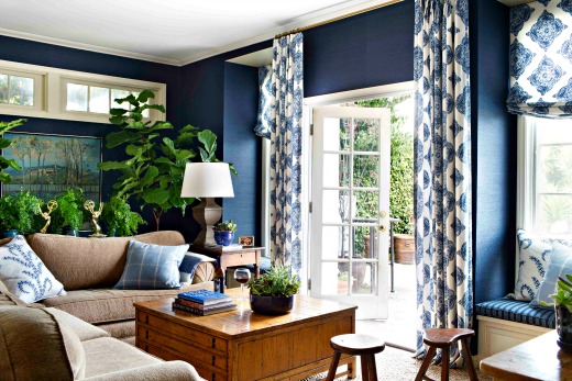
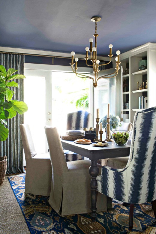
Favorite Colour? Navy blue is my favorite color, but I think I tend to use black and violet more than any other colors in the spectrum.
Favorite place to hangout (city, restaurant of chillin’ at home?). My mountain house in north Georgia, about an hour and a half from Atlanta, is my favorite place to hang out solo or with friends and family. It’s my happy place and the moment I pull up to it, all of the stress of my remodeling projects, show house designs, TV shooting schedules and budget management just goes away. But, unfortunately, there are bears and gigantic spiders in the mountains, so there’s that.
What is one design trend that you hate? I really, really despise when people shove sticks into vases and stick them into corners. This seems to be a trend that most major retailers just won’t ever let die, and I have no idea where the hell it came from in the first place. It makes me hate everyone.
Biggest design mistake that anyone could make? Buying matching sets…of ANYTHING. I know it makes life easier for people who aren’t professional decorators or designers, but matching sets are just impersonal, they’re like the “Kool-Aid” of the furniture world; just bust open the package, add water and you’re done. The only time I’m okay with sets of furniture is when they’re antiques. But even then, I will try to un-match them by changing up fabrics or even refinishing chairs differently than tables or headboards differently than nightstands or dressers.
AND most importantly who are you “Design Crushin'” on? Benjamin Vandiver who’s based in Nashville. He’ll be a household name pretty soon, and I’m sure he’s gonna make a huge mark on the design world. His work is absolutely stunning and tailored and edgy and unsafe and classic and timeless and just all around top notch. And I love how he pushes the envelope with his styling. There’s this one insanely gorgeous dining room he did, and he styled the center of dining table with sheep, or maybe it was goats. Anyway, it was some type of farm animal that makes a fun noise and has cool fur. Oh, and his use of art. And his use of black. And the fact that he looks like a 1950s movie star.
Thank you, Brian for continuing to inspire so many with your incredible talent! For more information about HGTV’s Spring House visit http://www.hgtv.com/hgtv-spring-house-2014 or for more on Brian’s Production Company and portfolio visit (flynnsideout.com).

