Summer is almost over, and quite frankly I’ve had little time to the things that I intended to do. Like re-do the bedrooms or give the living room a much-needed face-lift. It’s been a slow process, one that I’ve been dealing with for almost eight years. Then I decided that maybe we needed to throw an end of the summer blow-out party. Let’s face it most of us re-do our homes before we throw a party, it gives you the incentive to get things done fast. In fact, Mr. B. and I now have a bet, he thinks I won’t have it done before the end of the year, and I say I will. The winner gets a weekend at the place of their choice. Hmm...I choose Paris, or at the very least the Nordstrom shoe department.
This week I toured some new homes that are going up in our community, designed by Lew Oliver, one of the architects of Alys Beach in Florida. The houses were designed with European architecture and features such as walled in private gardens, formal decorative lentils, balcony’s and 8′ tall French entry doors. The attention to detail had me seriously re-thinking our decision to stay in our home for a few more years. While the homes were designed with a smaller footprint, it forces you to live well with what you have. As I get older, I crave less and would much rather downsize, although I would love a bigger closet (what girl wouldn’t?). The use of space in the Lew Oliver designed homes was efficient if not well-thought out. Which had me thinking about our home, and the challenging corners and spots that have had me rearranging for years, not giving up until I achieve design perfection. Sometimes there is a fine line between form and function, and I’ve always been a fan of function first (although who doesn’t love a perfectly styled corner?). Unfortunately, we have so many stools and ottomans filling up awkward spaces around Casa B. that I’m convinced people think all we do is sit down. So I wanted to share some pictures of some of my favorite spaces that combine function and style in those sometimes awkward spaces…and fingers crossed I can figure out my challenging corners & nooks.
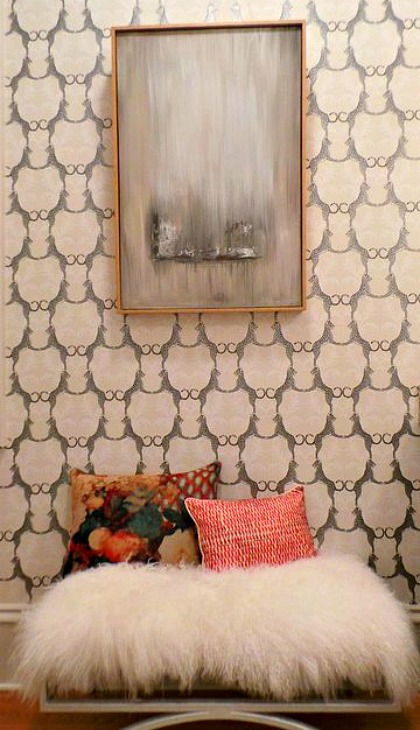
Photo/ Vicki Gladle Bolick-Designer/ Staci Steen
1. Add texture & pattern– give a quiet nook or cranny some texture & pattern for design impact. It also gives you a spot to place extra seating that can be added to a living space as needed.
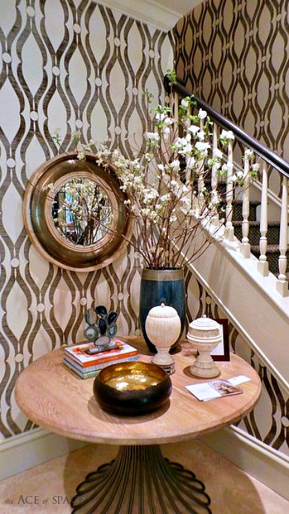
Photo/ Vicki Gladle Bolick-Designer/ Cathy Rhodes
2. Bring in tables – A table in an awkward corner provides functional space (for keys and mail), and opportunities to display mementos and eye-catching tables-capes. One of my favorite vignettes was one I saw at an acquaintances apartment on Fifth Avenue. She had antique books stacked around a round table (spines facing out) with a large fern placed in the middle. It proved to be an artful display and gave her an opportunity to showcase her collection.
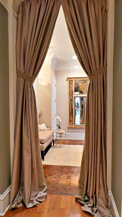
Photo/ Vicki Gladle Bolick-Designer/ Nina Nash
3. Add chairs -Adding a comfortable & interesting chair (my favorite) to a quiet corner, allows you a little place to escape, curl up and read a book, or enjoy a glass of wine. Making it stylish & functional.
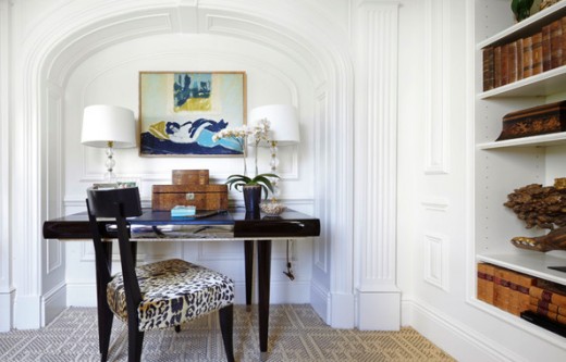
Photo/Kips Bay Showhouse
4. Add a desk – This picture is from the Kips Bay Showhouse, and was one of my favorite nooks. A niche is the perfect spot to add a desk, and chair. If you are starved for office space in the home, look for a little area to place a desk (this spot was ideal since it was located next to a bookcase).
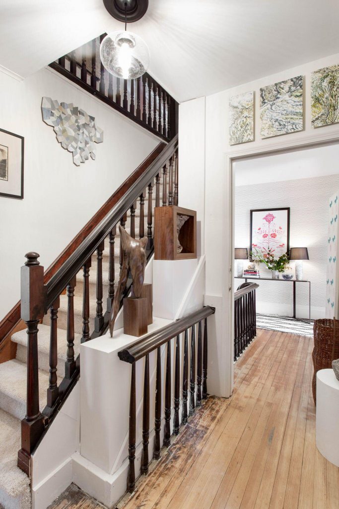
Photography/Rikki Snyder for the Kingston Decorator Showhouse
5. Stair Landings – If you have a spacious stair landing, try adding a work space or window seat. I once added a deep window seat to a clients landing complete with lots of plush pillows and a small drink table. It became one of her favorite spots to relax. Landings are often overlooked as functional space, but as you can see from this picture this is simply a brilliant use of otherwise wasted square footage.
6. Build a bookcase– If you have an empty or challenging wall, add a shallow bookcase or shelves. It not only provides display space, but additional storage.
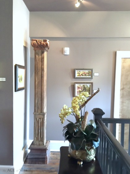
Photo/ Vicki Gladle Bolick
7. Bring in Architectural Elements – I love using over sized architectural elements in corner spaces. It’s not only visually appealing, but if done in a hallway it can function as a small art gallery when balanced with other pieces.
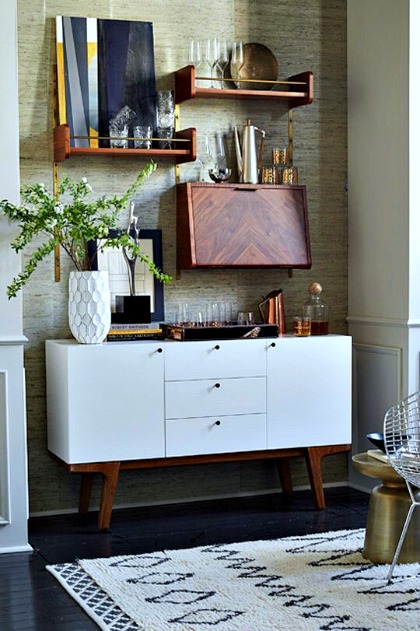
8. Create A Functional Wall Display – I filed this photo away because it has to be one of the more functional wall displays I’ve ever seen, and it’s perfect for this challenging niche. It’s a bookcase, bar, miniature art gallery and storage all located on one wall. The perfect use of space.
I hope you are all having a wonderful summer, of course I look forward to sharing more great design, entertaining tips and of course “haute” hotels.
Don’t forget to follow us on Social Media for more design inspiration and happenings.
https://facebook.com/theaceofspaceblog
http://pinterest.com/bolickinteriors/
http://instagram.com/theaceofspaceblog.com
https://twitter.com/theaceofspacebl
If you are a designer or blogger and plan on being at AmericasMart on July 8th at 3:00, I’ll be participating on a panel about working with brands. Stop by to find out more about this hot topic or just to say “hi.”
Until next time,
BE INSPIRED. BE AMAZED.

