I am drawn to drama. The kind created by paint, warm velvets and sparkly chandeliers. Which brings me to my current dilemma, I have until the end of the year to finish our downstairs bath (for a secret project). I was ready to begin demolition and then I saw a picture “that launched a thousand ships” right down the drain of our powder room. It was a picture of a heart-stoppingly dramatic bathroom swathed in a dark mystery paint (maybe Farrow & Balls No. 95?) with gorgeous fixtures. When you see it, you’ll understand that I truly haven’t lost my mind (in fact it’s brimming with possibility).
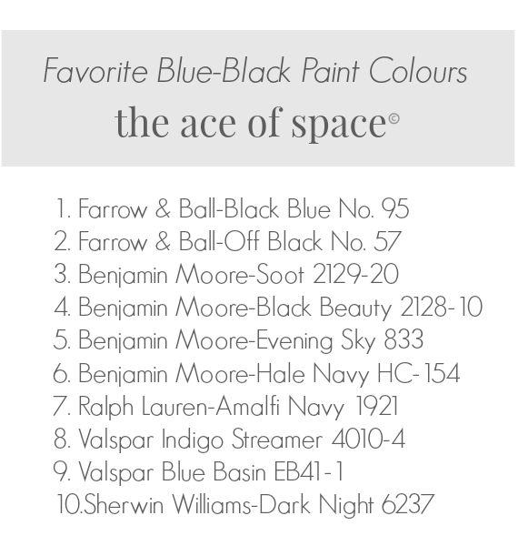
Two spaces that I designed for past clients happened to be painted floor to ceiling in Farrow & Ball’s “Black Blue” No 95 (my favorite colour of all time). The first time was a gentleman’s library, with the shelves and mouldings painted in high gloss, I used burnished brass fixtures, a tartan plaid Ralph Lauren “Black-Watch” plaid carpet, and warm rich leathers. It was stunning, dramatic and quite frankly a tad sultry in a very masculine way. Although, sultry is not a word most would associate with my former client, a well-traveled, Cuban cigar smoking, retired pro-ball player (who had two agility dummies in his backyard). The other space was a Powder room for a very hip, urban couple who wanted drama, so we pushed the design envelope by painting all the walls in F&B Black Blue, and papering the ceiling in gold leaf. I miss that bathroom. If you ever want a sophisticated blue, go with F&B Black Blue (more of my favorite blues below)…
I think as I get older I want a cleaner, streamlined more metropolitan look in my home, and I know I’m not alone. I crave All-American glamour associated with the pages of any given Ralph Lauren catalog (wait to you see what Ralph has planned for 2016). Dark, sultry & dramatic. And perhaps that’s my challenge, I want cleaner lines and sophistication in my home, unfortunately, we are currently caught between styles defined by my love of the coast & mid-century modern. Maybe I’ve come up with a new genre of design, Mid-century coastal?
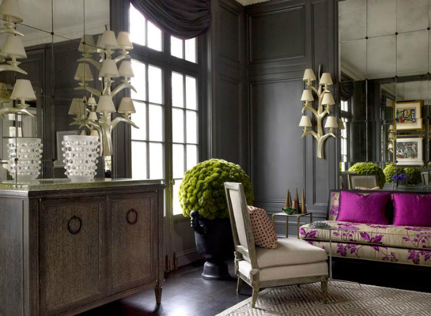
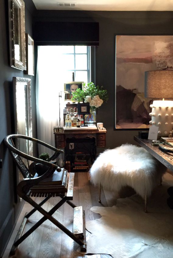
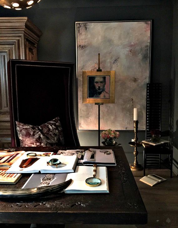
This past week, I’ve truly missed practicing design due in part to several visits to some spectacular homes, which I’ll share via pictures in the next few weeks.. One room I’ve included today was an office/den designed by Jason Mitchell of SmithBoyd Interiors. It was dark & dramatic, wrapped in a sultry blanket…you’ll see. In fact, Jason I have a confession. I sat in the desk chair just for a moment (five minutes) to see & feel what it would be like to actually work in this space. I didn’t intend to leave until my reverie was interrupted by a tiny voice saying “Mommy why don’t they ever serve ice-cream at these parties?’ Yes, my little daughter is my plus one on weekends when I’m working. I tell her we are going to house parties, when, in fact, we are going to show homes. With my cover blown I had to vacate the seat (I think I have a year left before she figures it all out). For now it works and so did the incredible space by Jason Mitchell.
Photo/ Corian (Dupont)
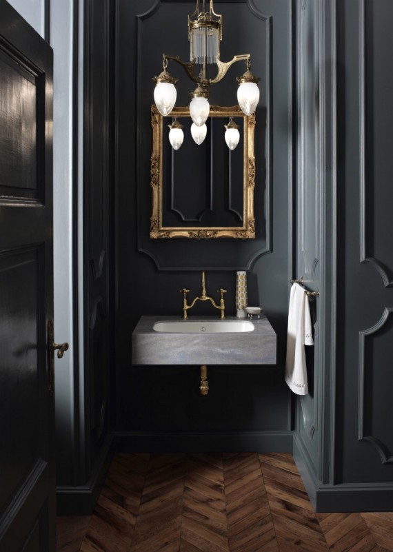
This IS the picture that made me totally reconsider my original design plan for our downstairs Powder room.
Designer/Caitlyn Murray
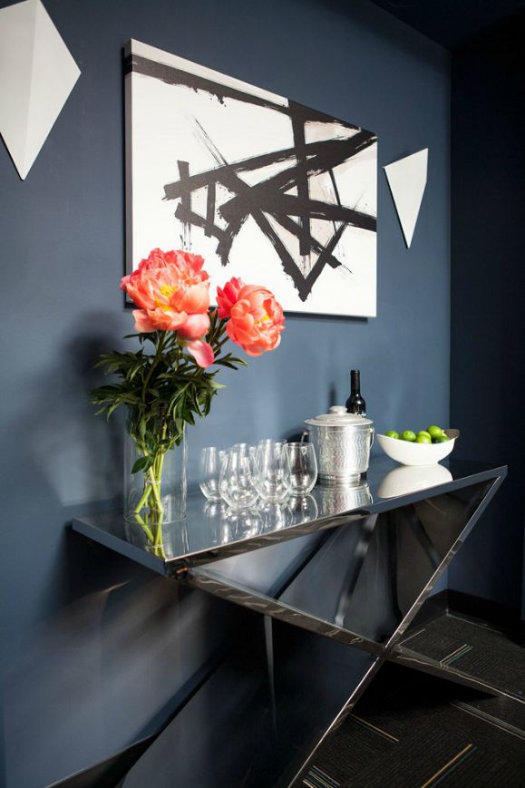
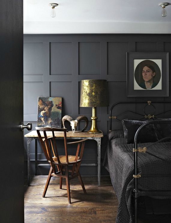
Dark interiors with metallic elements add light.
Designer/ Michael of 47 Park Ave. Blog
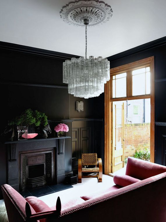
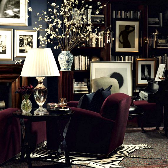
Dramatic sophistication in the form of multi-tiered chandeliers, velvet furnishings and all black walls.
Photo credit/ Farrow & Ball
Brass always looks so sophisticated against black.
Photo credit/ Ralph Lauren
Well…Ralph Lauren did define an era of glamor and sophistication.
Photo credit/ Ralph Lauren
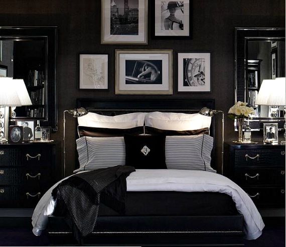
A black & white color palette is a virtually foolproof when building a dramatic space…
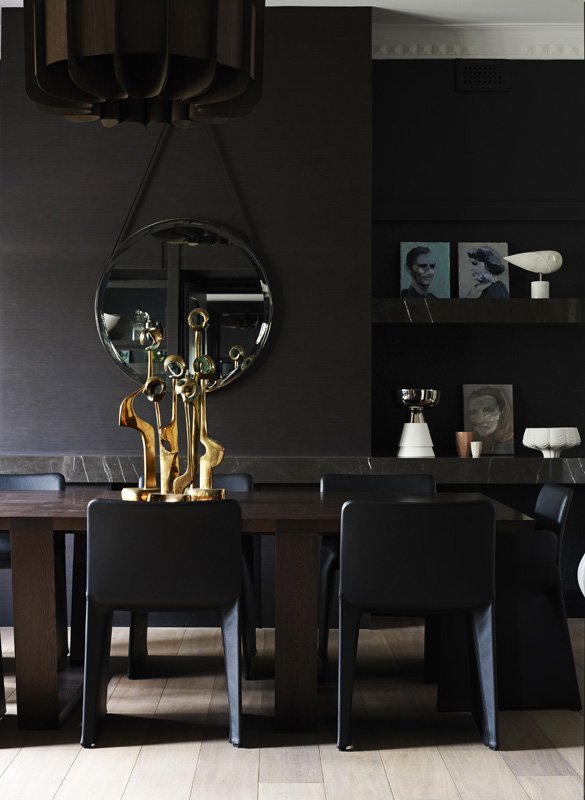
Designers/ Mim Design
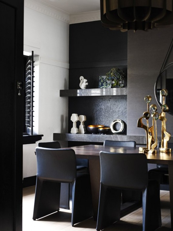
This sophisticated dining space is elevated by the introduction of shining brass accessories. Painting a wall white reflects light, and also breaks up the monochromatic color scheme in this striking room.
Designers/ Mim Design
The other side of this dark & sultry interior.
Designer/ Jason Mitchell of SmithBoyd Interiors-Photo/ Vicki Gladle Bolick
Although this space was much darker than it appears in the photos, lighting was strategically layered throughout the space. The den was a perfect mix of traditional elements with luscious layers of texture.
Designer/ Jason Mitchell of SmithBoyd Interiors-Photo/ Vicki Gladle Bolick
A high-backed chair in wine-colored velvet sat behind an engraved walnut desk. Functional vignettes brought in architectural interest. I loved the mix of antiques with modern elements. Striking artwork provided color and lightness.
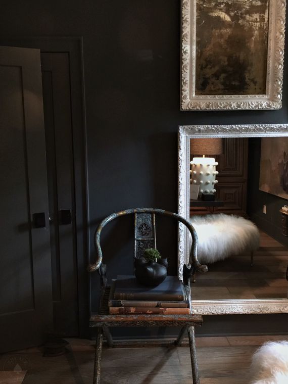 Designer/Jason Mitchell-Photo/ Vicki Gladle Bolick
I love how the room is reflected back in the mirrors giving a multi-dimensional view of the space. Genius.
As always, don’t forget to follow us on Social Media for more design inspiration & happenings.
https://facebook.com/theaceofspaceblog
http://pinterest.com/bolickinteriors/
http://instagram.com/theaceofspaceblog.com
https://twitter.com/theaceofspacebl
Until next time,
BE INSPIRED. BE AMAZED.

