One of my favorite past-times (obsessions) is visiting Showhouses and “idea houses” across the country. So just two (short) days after returning from High Point Market, I was invited to attend a private tour of This Old House Idea Cottage (sponsored by Lamps Plus). The home was chosen to showcase trends and innovations by one of America’s classic magazines and TV shows-“This Old House.” Several hours drive from Atlanta, Cloudland Station is nestled in a rolling valley off Lookout Mountain- complete with a swimming hole and rambling streams. Jill McKenzie of Steve McKenzie’s drove (thankfully) which allowed me to enjoy the positively breathtaking vistas along the way, and dream of a future move…
Cloudland Station is a gem of a community which creates the illusion that you just stepped through a time portal (at least a hundred years or so) into a sleepy little southern town complete with dirt roads, grist mills, covered bridges and a general store that is entirely dependent on “the honor system.” While the mountains signaled a changing of the seasonal guard, it was the homes dotting the countryside which captivated the attention. Painted an eye-catching array of iridescent hues, this inspired color palette was seemingly plucked from the flashy plumes of a peacock’s train.
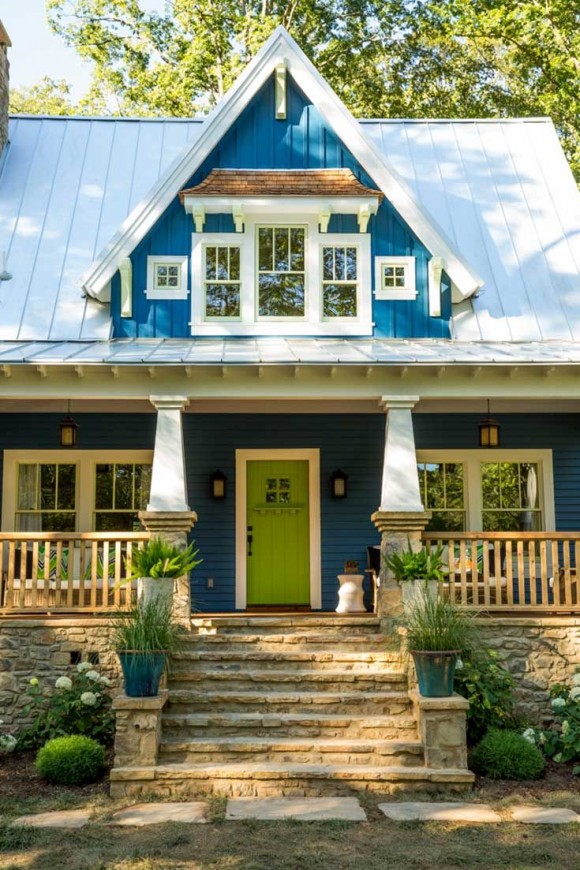
This Old House Idea Cottage was without exception to the bold colors used at the Station, a rich, vibrant blue (blueberries anyone?) covered the exterior of this whimsical craftsman styled house. Turn of the century charm combined with all the modern amenities of the 21st century. The community itself is worthy of its own post and in the near future I’ll be interviewing the incredible mastermind behind this innovative community. Although, the homes are smaller in footprint they are built on the current lifestyle trend of living large in smaller spaces. The gabled roof cottage was designed with a purpose- to utilize every inch of approximately 1900 SF of living area.
The eye-catching interior was designed by the uber talented Atlanta designer, Yvonne McFadden, and her incredible team. A veritable wonderland of style, color, and unique features. Unfortunately, one of the challenges for me over the past several weeks was the fact that I couldn’t publish any pictures until the magazine came out (that’s like telling me, a Design Blogger, what the “Color of the Year” is, and then making me promise I won’t tell anyone for 3 months). Yes, that happened. Well thankfully the magazine has hit the newsstands, so welcome to this year’s “This Old House Cottage.”
Designer/ Yvonne McFadden-Photo/ Vicki Gladle Bolick
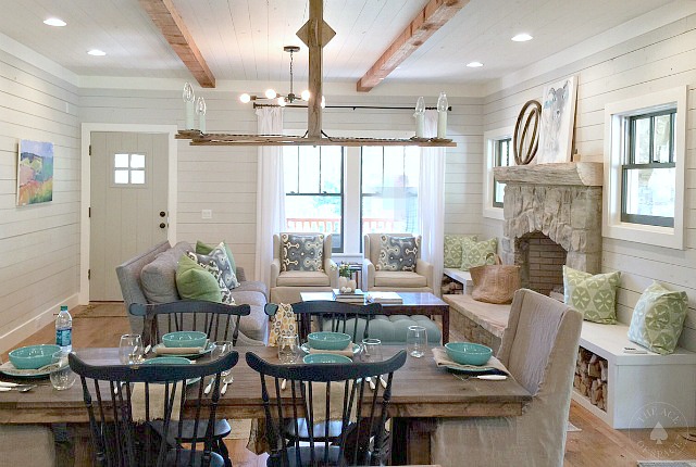
An open floor plan combines both the living and dining space. A custom trestle table was made by the resident finish carpenter, the perfect size for a smaller footprint. The raised hearth with a flagstone slab provides the focal point and additional seating. Red cedar beam set the rustic tone…
Designer/ Yvonne McFadden-Photo/ Vicki Gladle Bolick
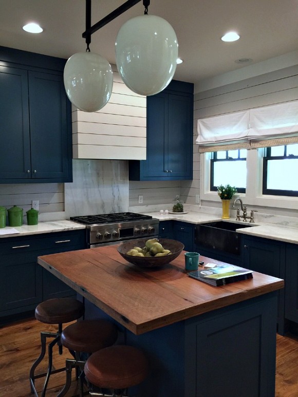
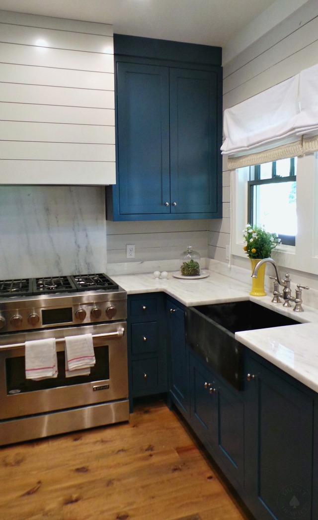
Custom cabinetry painted in rich blue is the perfect contrast to the shiplap walls which also covered the fascia of the vent hood. A custom light designed by McFadden was made from two vintage globes. The marble counters and backsplash provide rustic elegance in this striking kitchen.
Designer/ Yvonne McFadden-Photo/ Vicki Gladle Bolick
The apron sink was also a vintage find…
Designer/ Yvonne McFadden-Photo/ Vicki Gladle Bolick
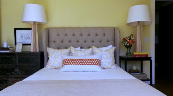
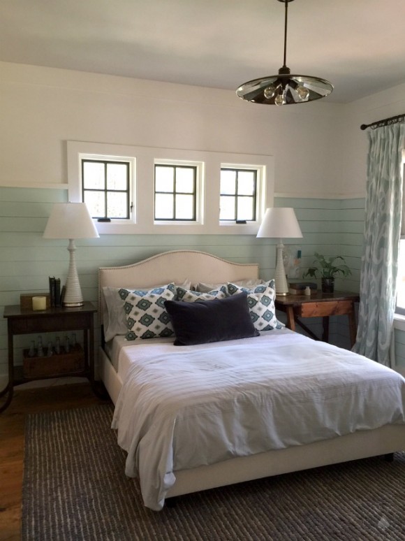
Shiplap is installed 2/3’s up the wall providing architectural interest. The bedding and window treatments add a layer of natural texture to this mountain retreat. McFadden also brought in a few age old finds to contrast with more modern day pieces.
Designer/ Yvonne McFadden-Photo/ Vicki Gladle Bolick
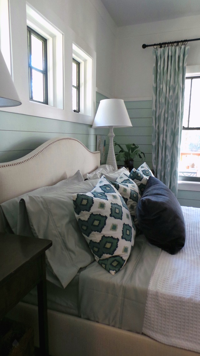
Cool toned accents bring in color & movement…
Designer/ Yvonne McFadden-Photo/ Vicki Gladle Bolick
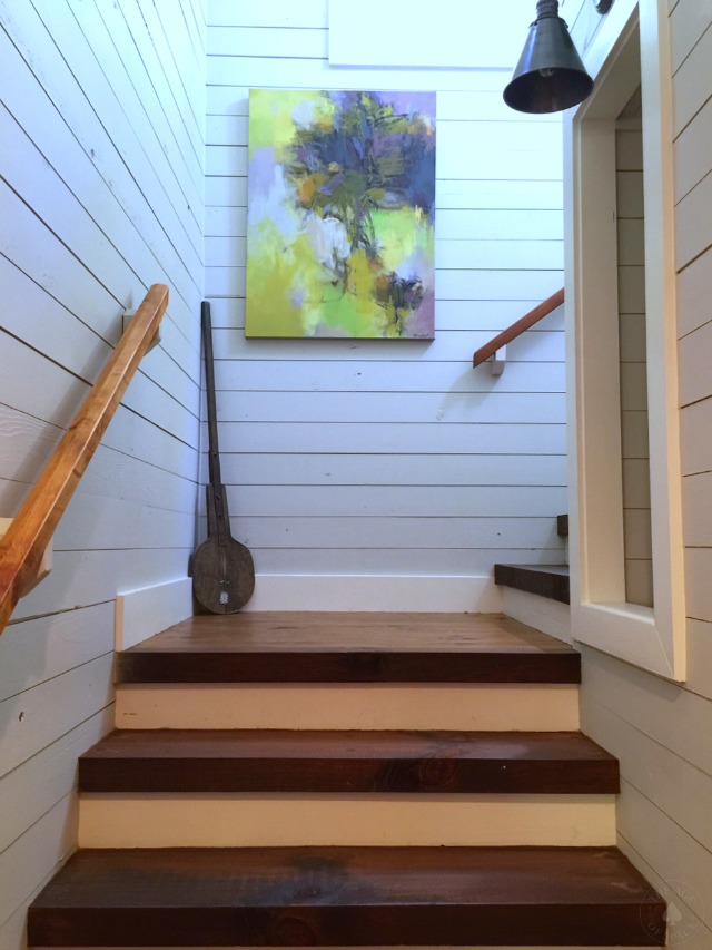
3″ thick stair treads lead the way to the 2nd-floor landing. A feature that is standard in all the homes located in Cloudland Station.
Designer/ Yvonne McFadden-Photo/ Vicki Gladle Bolick
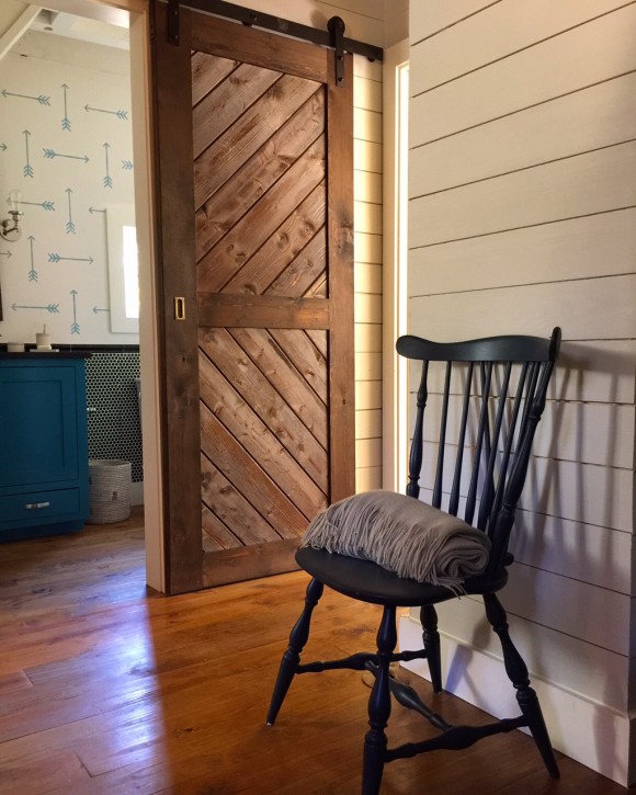
Another space-saving feature was the use of sliding doors which minimized the door swing on this second floor landing…
Designer/Yvonne McFadden
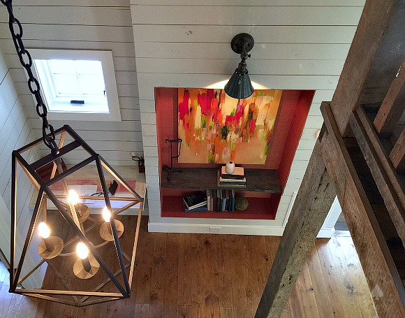
From the loft, a view of one of the many niches built to take advantage of empty space, converted into storage or bookshelves.
Designer/ Yvonne McFadden-Photo/ Vicki Gladle Bolick
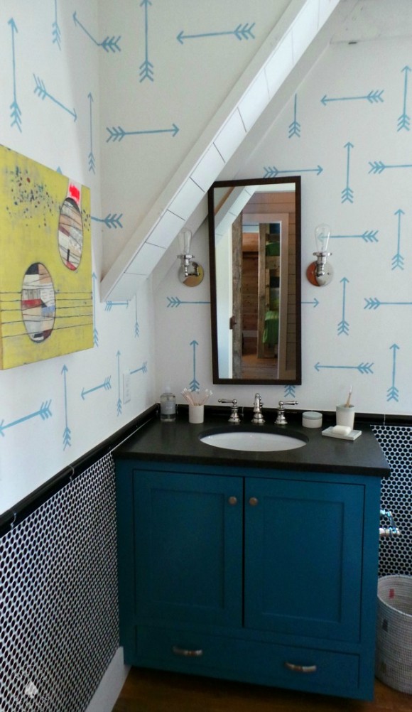
What this bathroom lacked in space, it made up for in style. Penny round tile from Tile Bar was installed halfway up the wall and white penny tile was featured in the shower surround. The Arrow motif gave the illusion of wallpaper but was, in fact, hand stenciled by Yvonne and her team.
Designer/ Yvonne McFadden-Photo/ Vicki Gladle Bolick
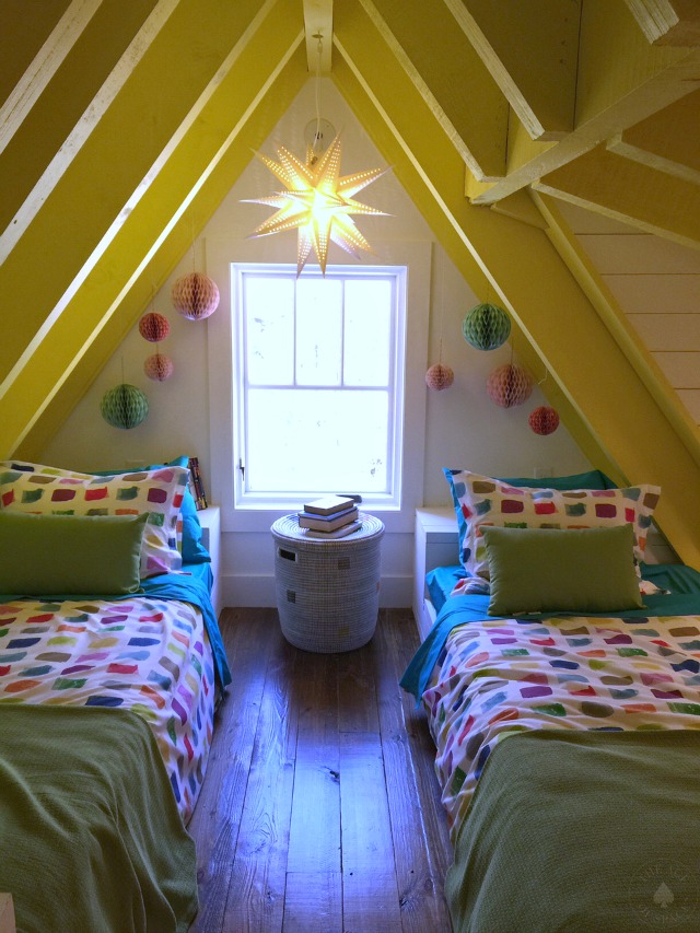
Asleep under the eaves…space saving twin beds and cabinets were a few built-in features in this child’s room.
Designer/ Yvonne McFadden-Photo/ Vicki Gladle Bolick
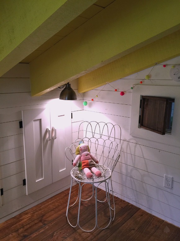
A quiet corner complete with extra built-in storage and a whimsical peek-through for tiny eyes...
Designer/ Yvonne McFadden-Photo/ Vicki Gladle Bolick
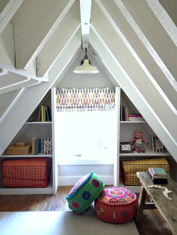
The playroom also featured built-in shelving, and colorful poufs provided extra seating in this loft space…
Designer/ Yvonne McFadden-Photo/ Vicki Gladle Bolick
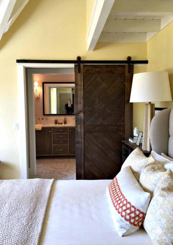
Another space saving sliding barn door provides a glimpse into the master bath…
Designer/ Yvonne McFadden-Photo/ Vicki Gladle Bolick
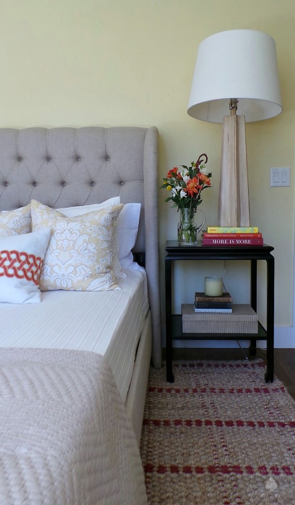
Layers of soft textures and subtle pops of pattern bring style to the second master retreat.
Designer/ Yvonne McFadden-Photo/ Vicki Gladle Bolick
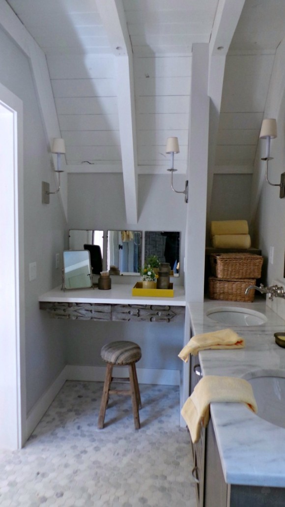
There were so many unique and thoughtful features in this home and this master bath was no exception. When the original vanity wasn’t ready in time, Yvonne had one created complete with a piece from a salvaged door on the vanity table apron.
Designer/ Yvonne McFadden-Photo/ Vicki Gladle Bolick
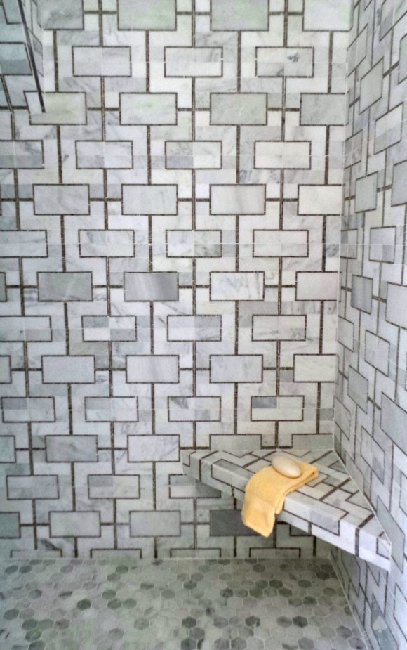
The tile added a modern element to the master bath with marble in graphic patterns featured on the walls and flooring. The perfect blending of old with new…
If you want to find out more about Cloudland Station visit www.cloudlandstation.com. This innovative community goal is committed to building homes with smaller footprints, preserving the surrounding greenspace. I’ll be sharing more in the near future.
As always, don’t forget to follow us on Social Media for more design inspiration & happenings…
https://facebook.com/theaceofspaceblog
http://pinterest.com/bolickinteriors/
http://instagram.com/theaceofspaceblog
https://twitter.com/theaceofspacebl
Until next time,
BE INSPIRED. BE AMAZED.

