It’s 2014. Finally. I was so ready for a new year, new start. With a new year comes new projects, new adventures, and a new look for my blog. I’m excited about 2014 and all the possibilities coming my way. Truth be told I didn’t work on a lot of design projects last year. I took the year off to work on my blog, and the product collaborations that required travel and my attendance at some amazing events. Being in the company of some of my favorite design icons was a dream come true, and I was so incredibly honoured. Am I still pinching myself? Absolutely!
So what better way to start the New Year then with a project that I completed last year. There were more improvements and additions after the photos were professional taken, but I thought I would share some of the pics that I took when we were about 75% finished. It was a labour of love, with a budget that was a “designers dream come true”. Were there sleepless nights? Yes. A lot. In fact, I think Mr. B. wondered if I had a secret second home. I was there every day, all day for the better part of five months. There were tears, tantrums and total chaos. There were days of “do-it-yourself” which had my design assistant and I putting up a seemingly life-sized wall mural of Broadway. And then taking it down, and putting it back up again because the walls were not plumb or level. In the end, the client’s Broadway bound daughter was happy, and all I could see was a quarter inch difference from one side of the mural to the other (all because of an uneven ceiling line). The house was full of Hickory Chair, Baker, Vanguard and silk fabrics from Brunschwig and Fils. My clients were Expatriates who relocated to the states from Singapore, she was the CEO for a large non-profit, and he was an executive for UPS. It was a marriage made in heaven for all of us, I was able to stretch my creative muscles, and they had a great appreciation for the “finer things in life.” Some of the pictures appeared in few magazines, and since they have already hit news stands, I am now able to share the remainder. So before I’m off to new adventures, here’s one from 2013…
Designer/ Bolick Interiors-Photo/ Christina Wedge
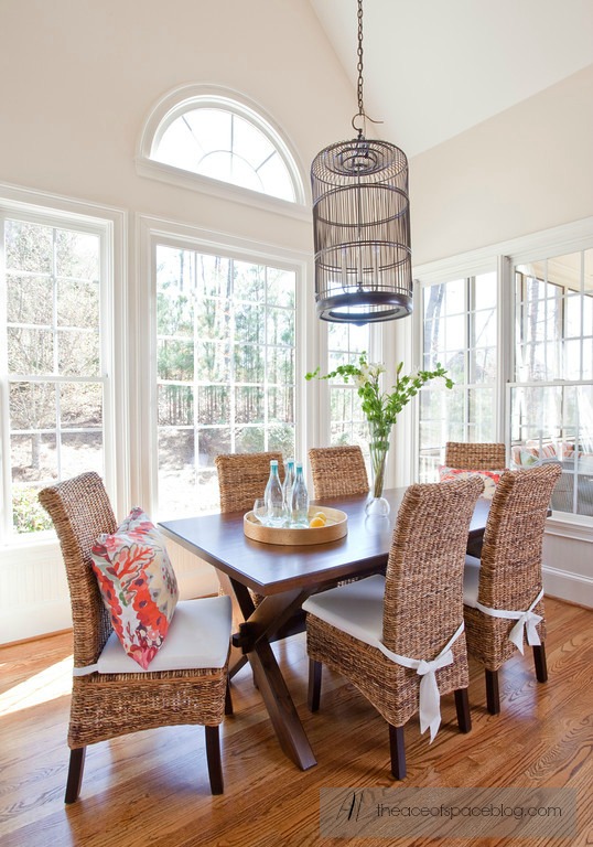
The breakfast room will eventually have drapery after the landscaping is finished. We added a custom light made from an antique birdcage from Singapore. In all honesty, I was cringing when I found out that they had to cut out the bottom with a jigsaw, but in the end it looked stunning. The client wanted furnishings in warm woods with a slight Asian flair, and the chairs are made from sea-grass…
Designer/ Bolick Interiors- Photo/ Christina Wedge
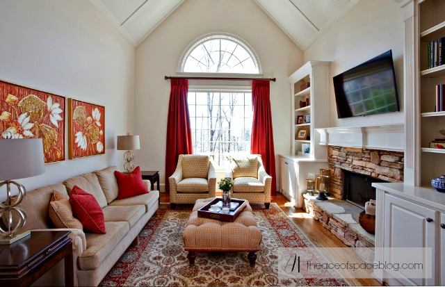
We added/ or repurposed all the furnishings in the Keeping Room, the rug was shipped over from Singapore, and we used the client’s own artwork as a spring board for the warm color palette. Although, they are more traditionalists the art collection leans more toward contemporary. We recovered their sofa in a fabric that was reminiscent of grasscoth (another nod to Asia), the rest are from Hickory Chair, and Bernhardt.
Designer/ Bolick Interiors- Photos/ Christina Wedge
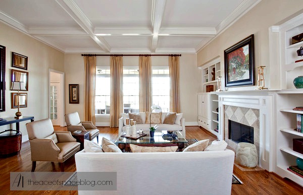
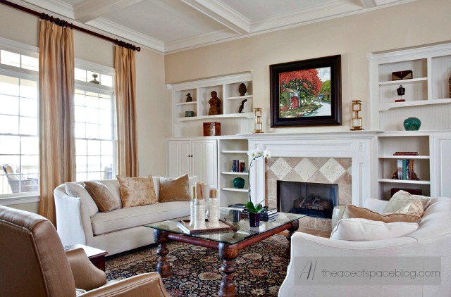
This room is my personal favorite. We were able to use custom pieces and fabrics in silks and linens. The colors were chosen from the rug, another import from Singapore. My clients brought back accessories from their eight year stay overseas, and we incorporated them into the design. The coffee table was made from a Asian baby bed and a glass top was used to allow an unobstructed view of the rug, keeping the room light and airy. Since the photo was taken we added artwork to the right facing wall beside the window to add balance, and bookshelf lighting to highlight their collection of Asian antiquities. The curved lines of the sofa and chair soften the straight lines of the occasional tables.
Designer-Bolick Interiors/ Photo-Christina Wedge
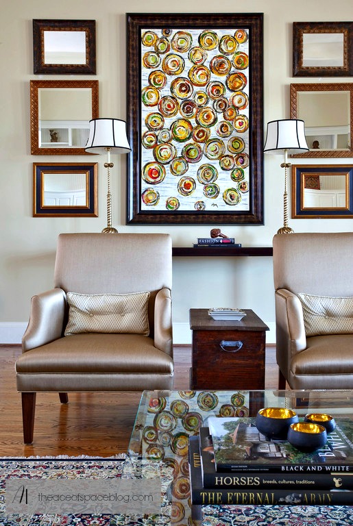
A view of the custom chairs and the Baker console table. The custom chairs made from silk purchased in Asia, and treated for stain resistancy. The artwork is the from the clients private collection. Custom mirrors were added in various sizes to break up the symmetry of the seating area and add a little visual tension.
Designer/ Bolick Interiors-Photos/ Christina Wedge
The custom linen sofas are resplendent with silk pillows. We chose paint colours for the entire house, and chose hues in soothing tones and soft colours to let the antiques take center stage. The draperies were constructed from a synthetic silk to eliminate fading and shredding caused by too much sunlight.
Designer/ Bolick Interiors- Photo/ Christina Wedge
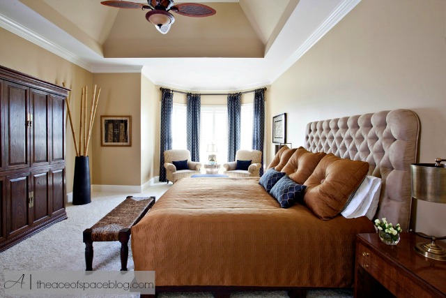
The armoire and bed were the clients own and custom made in Singapore. They were absolutely stunning. The clients had future plans to change out the headboard material so we didn’t have to use that as a consideration when choosing the tones for the space. Again, we used the Asian artwork as inspiration for the colour pallette. To compliment the simple lines of bed platform we designed a boxed coverlet, the drapery and pillows were constructed from materials in tones of gold and blacks. After the photos were taken we added antique Asian screens to the Master-bath windows, they were retrofitted into custom frames by Stewart, our carpenter extraordinaire. Stunning.
Designer-Bolick Interiors/ Photo-Christina Wedge
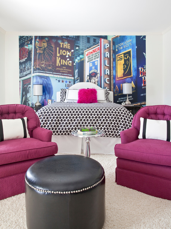
One of the teen suites in the home, this is for a young lady who is Broadway bound. We added a mural to the accent wall to give the illusion of a busy city street. She loved fuschia and black, so we repurposed several of the clients chairs and recovered them giving her a seating area. More of the room didn’t make it into the photos. The window treatments were designed to look like theater curtains, and on the opposite wall was a desk, bookshelves and chair giving her a place to do her homework. We used a lot of fun and tactile fabrics giving her a place to dream her “big city dreams.”
I hope you enjoyed this home tour, there was a lot more of the house that was never photographed, I wanted to showcase the best of the best. The house had over 7500 sf of living space, and it would have taken us a few days to capture every room. I’ll be sharing more projects in 2014. One of my goals this year is to bring more original work to my blog, and also highlight unknown but amazing designers that I have been following.
Here’s to a great 2014!
Cheers!
Please note that all the work is the sole property of Bolick Interiors and any reproduction without proper credit is strictly prohibited.

