I’m just days away from renovating our Master-bath, it’s a total gut of a builder grade space. Some re-configuring, tearing down and overall general construction mayhem. Before my blog became a full-time job, I was a designer, and I suppose that’s a hat I’ll never take off. So when the P/R firm for Kohler- (shout out to Josh, Kate & Lauren) contacted me and asked if I would be interested in what has turned out to be a whole master-bath renovation, I jumped at the chance. I think I would have gutted any bath in my house for Kohler. The products are going to be from their luxury bath line, including a custom designed dual vanity, sinks, toilets, faucets, and shower assemblies. The cabinet was delivered this week, and quite frankly it is positively stunning. We regretfully had to decline a tub. It would have required a crane, and Mr. B. had a hard time putting his game face on for that design adventure. I was totally on board, seriously it’s not as if we live in a suburban high-rise.
There are two things that I am struggling with before I drop the hammer. One is wallpaper in the half-bath, and the other is the tile. You have to really love it right? I have narrowed it to several options, and I think I’m just going to sleep on it over the weekend. The wallpaper in the half-bath is definitely going to be a Venetian Marble pattern. Did you think that was a trend of the past? Well…it came back, and has been hot, hot, HOT in design. Which is why it’s this week’s “Comeback Kid.”
The fine art of Venetian marbled paper has been around for centuries, and in the past it was mostly seen on the book bindings of high-end, antique or vintage books. Fast forward to 2014, and I am still enamored with this unrestrained family of patterns (outside of the bindings found on my treasured collection of 19th century tomes inherited from my grandfather). The swirling motifs have been updated and modernized across the design board, and the motifs can be bold or subtle. An adventurer at heart, I lean more toward the bold and my better half the opposite. What is the saying “go bold or go home?” or go “bold in your home?” I’ll go with the latter. Thankfully, this pattern has reached a point of mass appeal and you’ll soon see why, but the patterns are not for the faint of heart which really makes them the perfect choice for an accent wall or in a small space.
Here are some of the options that I am considering for our half-bath. I have an idea of which one will make the cut…but I’m going to have to keep it a secret (for now)…
via schumacher.com
An interesting (if not stunning) take on a centuries old technique…
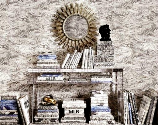
via schumacher.com
From the Martyn Lawrence Bullard collection…this paper has my mind swirling with possibilities.
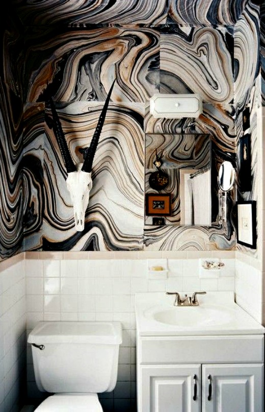
via Nicki Clendening
The perfect example of the impact this stylized pattern can make in a small space. I am positively obsessed with this wallpaper…
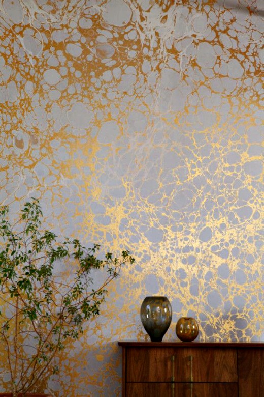
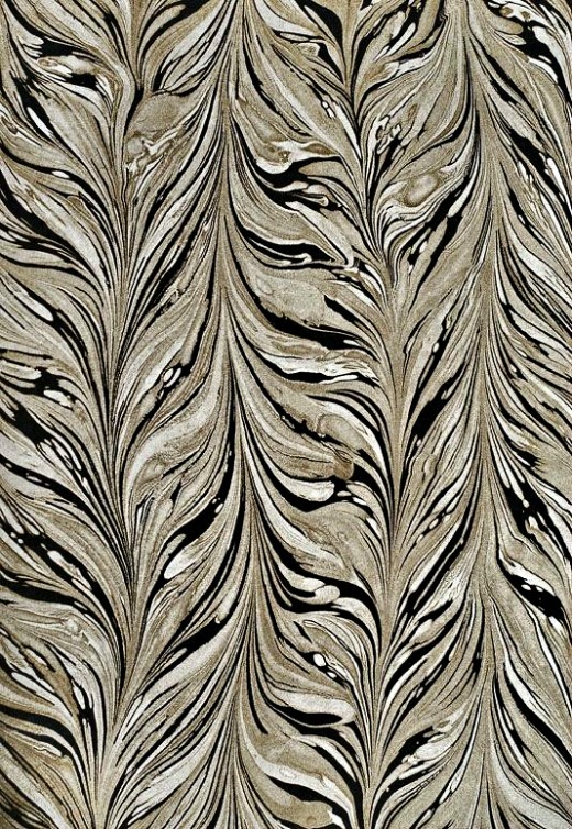
via calicowallpaper.com
Metallic’s are hot this year, and this paper is no exception…
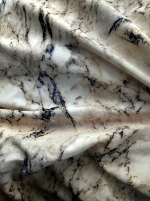
Fabric by Iera Mazeikaite
This pattern is so reminiscent of Venetian marble, and would be perfect as a window shade…
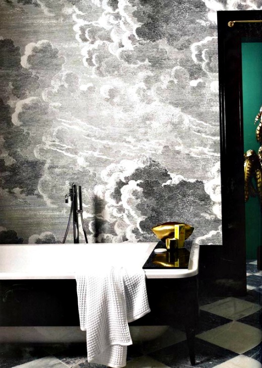
Via otakugangsta.com
This paper is fluid and sophisticated…
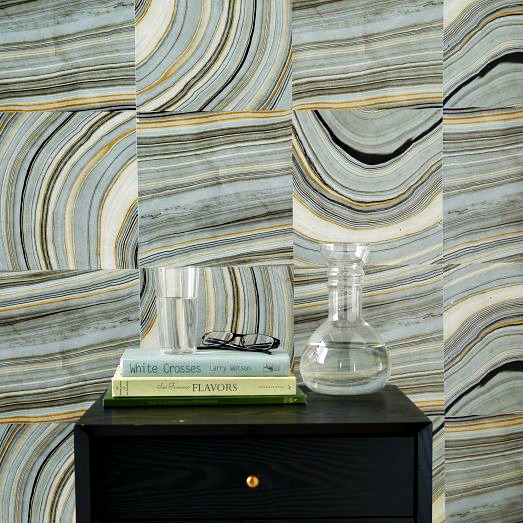
via West Elm
This pattern is a gutsy choice. The wall tiles can be placed in any direction…
I hope you are inspired to make bold choices….
In September we’ll be posting 5 days a week…including our new section “The Ace of Entertaining…” So check back often, and if you want even more design inspiration, follow us on Pinterest, Facebook, Instagram & Twitter.
As always,
BE INSPIRED. BE AMAZING.

