As a design blogger I receive a lot of inquiries to review products, we may do some but we don’t do a lot. It’s a highly selective process, and if I do one, I feel obligated to do all. So when IKEA sent me an early preview catalog to look at, it sat on my desk for a little while (a few weeks that turned into a few months). I’m not an IKEA girl, although I will say that I know several high-end designers who have used some of the product, and the result has been flawless. I let you in on a secret- Ikea is a designer’s shortcut. Yes, some of the biggest names who have access to some of the fanciest stuff will mix in a little IKEA. I am a big fan of mixing high-end and low-end, so after hearing a little buzz in the design community about some of the new product introductions at IKEA, I did a little “browsing”…and I was fairly impressed. I know I can be a hard sell but after touring many custom design studios my reservations were mixed with a little old fashioned design snobbery. So this is where the “eating humble pie”moment happens. There is something about IKEA that frankly tugs at you a little, the store is downright cheerful. Since we do have a store in Atlanta, I have gone there on the rare occasion when designing kid spaces at the behest of my clients. Frankly, it’s a little on the fun side; a kid in a candy store moment combined with brilliant marketing (plus they have mouth-watering Swedish meatballs in the cafeteria). There are seemingly endless possibilities in mirrors, case-goods, rugs & accessories, even lighting. Oops..I forgot to mention that the chandeliers in my daughter’s bedroom came from the eponymous Swedish retailer, and they look pretty good. A secret that most designers won’t share is that given the opportunity we have and will use IKEA. In fact, I once saw a world-renowned designer in the frames section with her entourage in tow (she had 3 shopping carts full of RIBBA frames), and I literally tripped over a display in the store when I saw her. It was partially because she was in IKEA, and also just because I have a design crush.
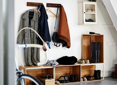
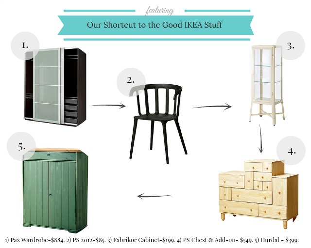
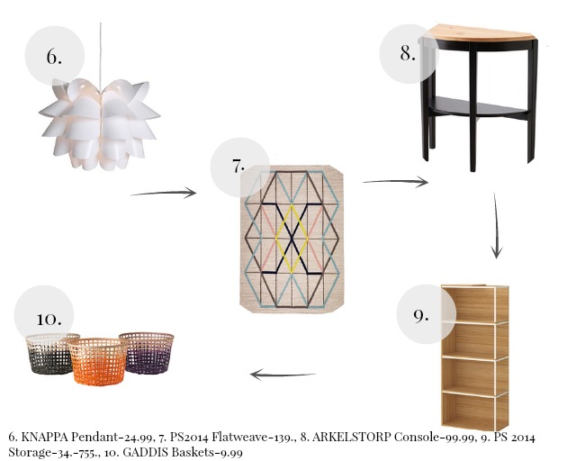
So I thought I give my readers a short-cut to the good stuff, some of my picks that I have used (frames in the dozens) and others that I think have possibilities, one of the newest introductions is the storage from the PS2014 Urban Collection, the options are endless, and in a mudroom it’s virtually foolproof. On a side note: I had a personal tour of the HGTV Urban Oasis Dream House in Atlanta yesterday, and it was fabulous. I have all fingers and toes crossed that I would be the lucky winner of this luxurious residence decorated by HGTV’s Lindsay Pumpa, who is great fun by the way. I’ll have several posts next week dedicated to some really great design and fabulous furnishings by AllModern. As part of the press, its always an incredible honour to see behind the scenes and share the design vision and personal photos with my readers. You’ll see the space firsthand before the show airs on HGTV mid-Sept.
Of course if you want to see the PS 2014 storage units in action, I’ve included a photo (below) showcasing this versatile grouping in action. Don’t you think the GADDIS baskets above are pretty swanky? I’m going to get a few for my office in black because I love them that much…
The PS2014 Storage from IKEA…
and I’d like to end on a little design wisdom from Albert Hadley that I love, it’s all about mixing high-end with low-end. Even Albert did it.
Have a great weekend, and see you on Monday with another fabulous “Southern-Tastemaker”-Julie Couch…
Until then,
BE INSPIRED. BE AMAZING.
As always don’t forget to follow us on Pinterest, Facebook, Instagram & Twitter for more design inspiration. Do you want “The Ace of Space Blog” delivered directly to your mailbox? Then subscribe today. (Our links in the sidebar).


