I’m back from a crazy week, due in equal parts to weather and work commitments. The work portion involved an annual conference for Design Bloggers with inspirational speeches by some design greats like Nate Berkus, Bunny Williams, Brian Patrick Flynn (see my interview here) and opportunities to see old friends and meet new ones. Lot’s of fun events such as the Perspective NY at Bjork Studio in conjunction with Traditional Home and Sunbrella and a masquerade event at Pirch. Unfortunately, I missed them all, one because I was catching up with friends and I missed my ride, and the latter because I went out to dinner with Executives from Ethan Allen & Traditional Home for an awards dinner. Once again, I was a finalist for Best Overall & Best Writing on A Design Blog, always a “bridesmaid,” this year they honoured both the Winners and Finalists, which was an unexpected treat. Also, my hats off to Pirch and Bjork Studio for hosting the events in what are incredibly stunning spaces. Look for a feature on Bjork Studio in the next month her custom pieces are simply divine, and I’m a huge fan.
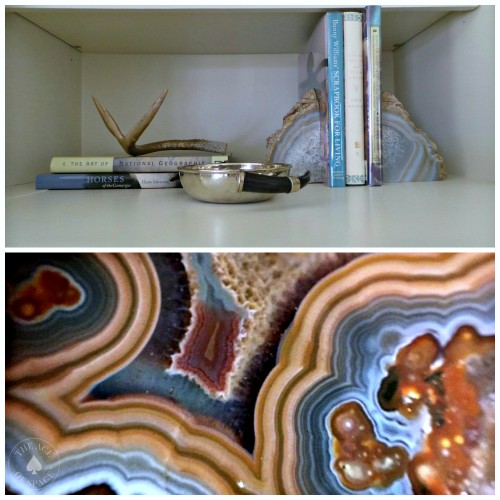
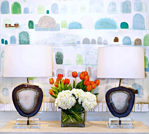
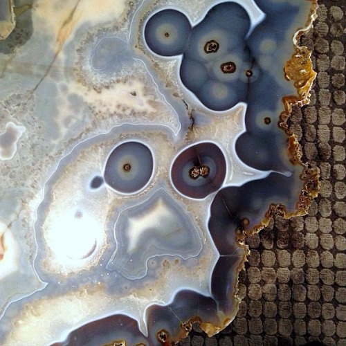
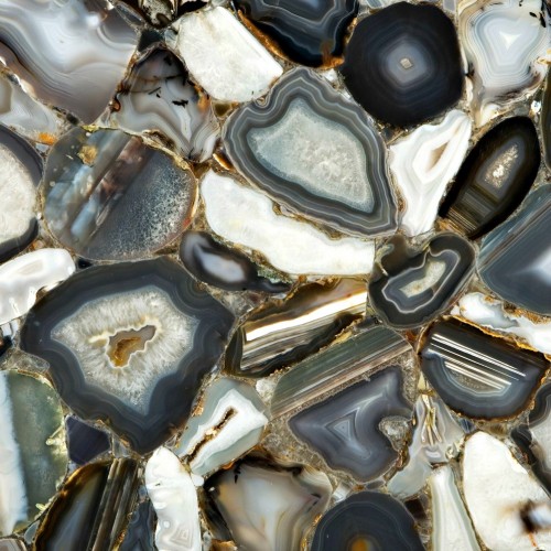
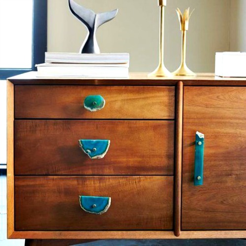
One thing that I think that has been evolving in design is the use of natural materials such as stone (not granite). Like Agate, which I adore. It’s timeless and elevates the idea of having a rock collection to a whole new level of sophistication. In fact, I’ve been collecting Agate for years, picking up pieces at crystal shoppes, antique & vintage shows and then affixing them to cabinet pulls, the top of boxes, Lucite risers and arranging them on bookshelves. I’ve even borrowed a few from my daughter who has also acquired a taste for this stone with it’s vibrant bands of colour. There is one thing that I know; you can never have too much of a beautiful thing. I think mixing bolder elements makes an interior feel less static, more evolved. In the words of Bunny Williams from last week’s conference “I love shaking it up a bit, contrasts make a space more interesting.” I think adding touches of bold colour or pattern, even in natural elements allows you to achieve that-“an interesting space.”
My obsession with Agates quite a few years ago when we traveled the coast of Oregon and stayed in the sleepy little town of Cannon Beach, every morning I would get up early making the trek to the beach to comb the gravel beds for red, green, yellow jasper & jade and garnet, the Agates I found were much smaller than the ones I use as bookends and “objects sur une etagère” (fancy French for objects on a bookshelf). My goal was to find just enough to fill a bowl, and quite frankly life is sometimes all about “the thrill of the hunt.” Unfortunately, Mr. B. saw a pile of rocks, I saw a colour palette, and another memorable experience.
Here are just some of my favorite Agate products from wallpaper to cabinet pulls.
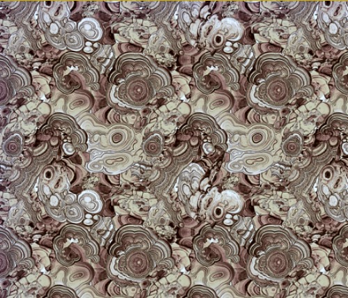
via spoonflower.com {link}
Agate Brown wallpaper by Ravynka, I can see this striking paper lining the back of a bookshelf, on an accent wall in a living room or in a small powder-room.
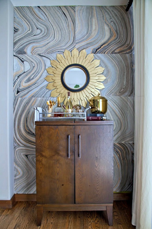
Rosa Beltran Design {link}
I love this bar niche, Rosa, a very talented designer used Agate paper squares and affixed them to the wall. The result is nothing short of stunning…
https://facebook.com/theaceofspaceblog
http://pinterest.com/bolickinteriors/
http://instagram.com/theaceofspaceblog.com
https://twitter.com/theaceofspacebl
Until next time,
BE INSPIRED. BE AMAZED.

