Flash back to Monday, when a designer friend called me and told me I should go check out a model home. What? A model home? Why? I had visions of faux foliage, mismatched pillows and ill-fated furniture placements. But, when I walked through the massive paneled front door (painted in a “to-die-for” high gloss grey), I was pleasantly surprised, and visions of moving-in danced through my head. Yes, I was overcome with images of hosting swanky dinner parties in the vastness of the open floor plan with the “plus ones” spilling out onto the expansive patio that was incorporated into the front elevation. When I first walked up the sweeping (hello Scarlet) front steps, it was as if the party had already started, black and white was the theme, from the stripped umbrellas to the chic seating. I could even imagine a scene from a Slim Aarons photograph capturing the “good life” that is inevitably going to take place on the front patio.
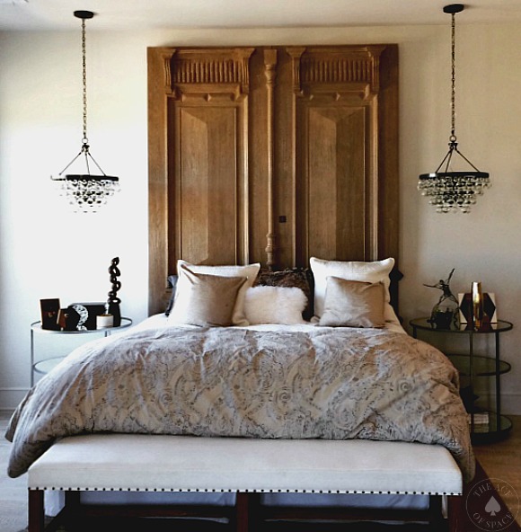
So after meeting some friends for lunch the creative genius’s of the blog Ends in Style (www.endsinstyle), I decided to stop at the “Model Home.” With camera in hand, I was excited to capture all the design goodness that was rumored to be inside. Not so fast. As soon as I whipped my camera out of an over-sized tote (seriously, who doesn’t carry their DSLR camera in their handbag?) Camera 1# wasn’t charged and my trusty back up-(aka the iPhone) was full of photos from High Point. Due to my lack of planning, I was able only to snap a few. One of which is of a look that I am obsessed with and that is using a pair of chandeliers. Either flanking a bed or in the kitchen, it adds a touch of glamour and a drip of class. Didn’t someone once say that “chandeliers are a girls best friend,” or was that diamonds? Either way, I’m seriously considering double chandeliers in our latest project #ProjectGuestRoom, I just have to find the perfect pair. Ah…there is very little that rivals the thrill of the design hunt, and it’s just beginning.
Photo/ Vicki Gladle Bolick
This is one of a few that I was able to snap, there will be more next week. I loved the soft sophistication of this space…
Smith Firestone Associates/ Photo-Megan Bob Photography
Luxury living given high style by a pair of chandeliers.
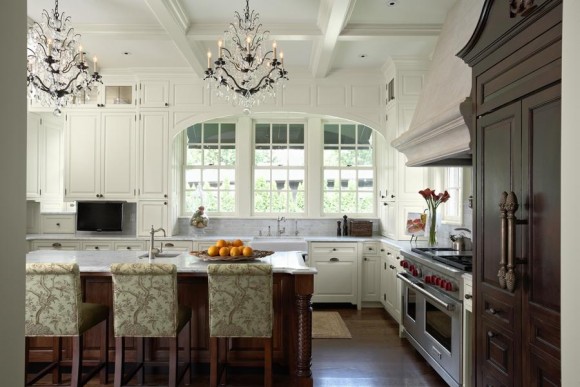
Home & Stone/ Photo-Donald Grant
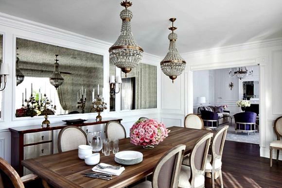
Traditional overtones given a little sparkle with a pair of crystal chandeliers.
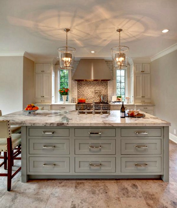
Beverly Bradshaw Interiors/ Cabinets-Collaboration Interiors-Tom Marks Photo
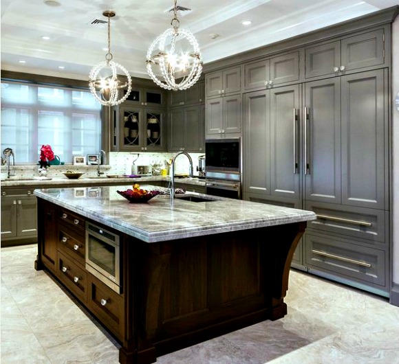
Chandeliers over the kitchen island, one of my current favorite looks.
via RightMove.co.uk
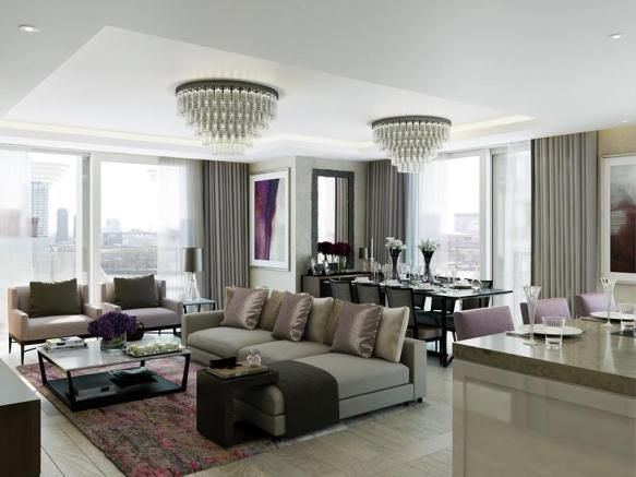
This property is for sale and can be yours for several million pounds. The double chandeliers in the living room give this space a swanky luxe look, and amplify the glamour.
via zillow.com
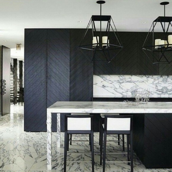
The grey cabinets are gorgeous, but so are the pair of chandeliers. I know these are technically chandeliers, but lanterns. Still gorgeous.
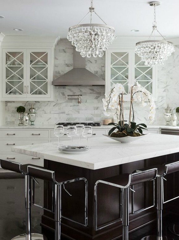
via Robert Abbey/ The Bing Chandelier
Who doesn’t love a black and white kitchen with a little bit of sparkle?
Twist Interior/ Photo Susan Gilmore
Traditional gets a twist…
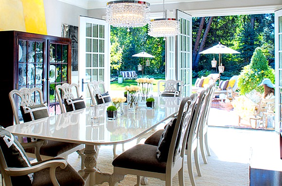
Design/ Elizabeth Kimberly
I love that the formal dining area opens up to a space that is so very perfect for entertaining. This floor plan gives a new meaning to “party in the back.”
I hope you are inspired to add a little sparkle to your life…
As always, don’t forget to follow us on Social Media for more inspiration…it’s everywhere.
https://facebook.com/theaceofspaceblog
http://pinterest.com/bolickinteriors/
http://instagram.com/theaceofspaceblog.com
https://twitter.com/theaceofspacebl
Until next time,
BE INSPIRED. BE AMAZED.

