Christmas is just 16 days away. How do I know? Because I have to keep track for my daughter on a very large chalkboard. However, what is just 4 days away? The last day of Atlanta Home & Lifestyle’s “Home For The Holiday.” So if you live near Atlanta, or farther away and feel the need to fly to the ATL (with the sole intent of experiencing some truly spectacular design over the weekend), you won’t be disappointed. I promise. While the south is cited for its charm, and incessant heat. It’s also quickly becoming the hub of some of the most notable design in the world. Of course, I do want to mention that I’m not even partial because I live here. I’ve visited some of the most renowned showhomes in the country, and we are certainly offering some fierce competition attracting the most celebrated designers in the country.
My original intent was to highlight each designer, but it’s Christmas and there is so much tinsel to hang at Casa B. with so little time. So today I’m featuring spaces designed by Steve & Jill McKenzie, Tish Mills, Robert Brown, Barbara Westbrook, Heather Hogan Roberts & Melanie Millner. From the music room to the rear stair hall, each space reflected the vision and signature flavour that have become synonymous with each designer. While the exterior of the 15,000 square foot residence is impressive it’s the beauty within that is certain to captivate and enthrall.
So welcome to Part 2 of Home for the Holiday’s. If you’d like to find out more about the Showhouse or to purchase tickets please visit www.atlantaholidayhome.com (To see the entire Series you can click the links here Part 1, Part 3).
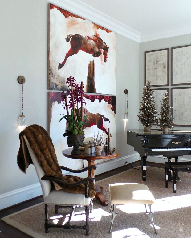
Designer/ Barbara Westbrook-Photo/ Vicki Gladle Bolick
The art room complete with a player piano is the perfect study in contrasts. With unique and utterly eye-catching pieces from the sconce on the wall, to the legs on the ottoman. Of course, the artwork throughout the house was some of the finest I’ve seen in any showhouse and this room was without exception.
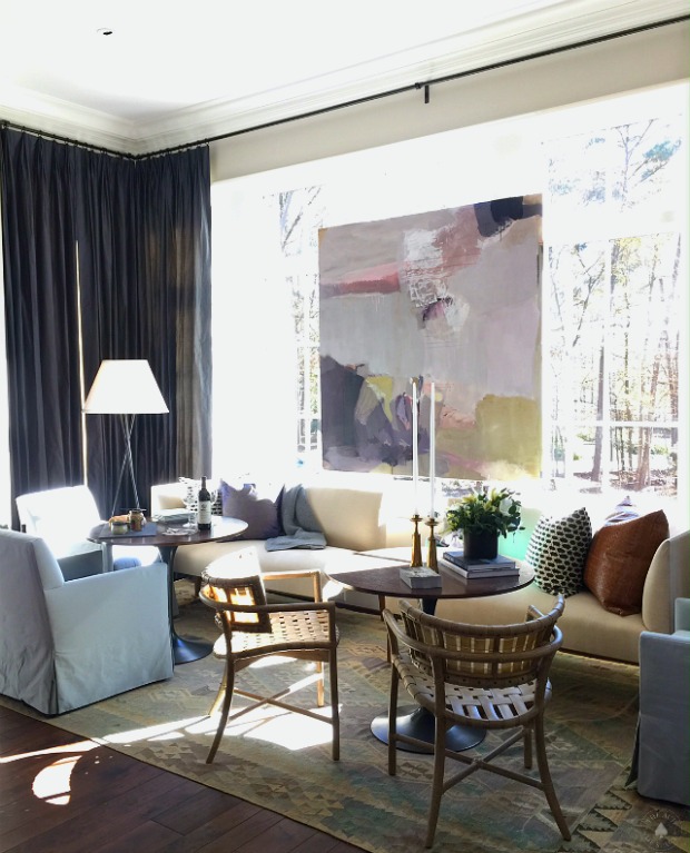
Designer/ Robert Brown-Photo/ Vicki Gladle Bolick
Robert Brown’s space is a mix of traditional lines and unexpected pairings. I went prior to the homes official opening, and didn’t get a chance to speak with many designers (they were busy installing). But, if I had to guess I would swear the accent chairs in the foreground were constructed of rawhide strips. And they were beautiful. The breakfast area is stylishly appointed for conversation or relaxation with the perfect cup of tea.
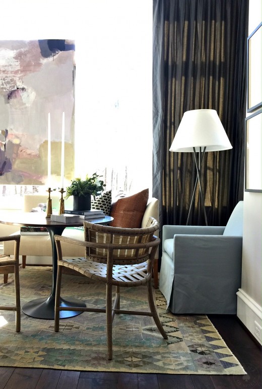
Designer/ Robert Brown-Photo/ Vicki Gladle Bolick
The graphic rug is the inspiration behind this sophisticated color palette. Being able to successfully blend neutrals is an artform, one that Robert Brown has so skillfully mastered.
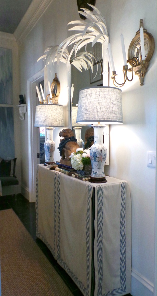
Designer/ Heather Hogan Roberts, Ivy & Vine-Photo/ Vicki Gladle Bolick
A skirted console with eye-catching tape provides space for an artful display. The statement mirror is simply divine with a palm branch relief on either side, another nod to classic design.
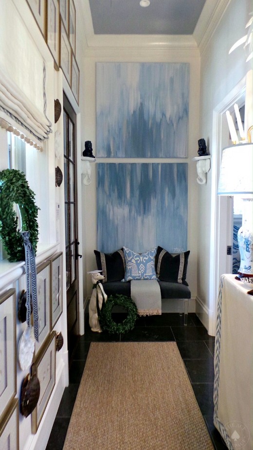
Designer/ Heather Hogan Roberts, Ivy & Vine-Photo/ Vicki Gladle Bolick
A classic color palette of blue and white. This hallway proves that small spaces can make a huge impact, and without a doubt, this entryway is making a grand entrance from the sisal carpet to the painted ceiling.
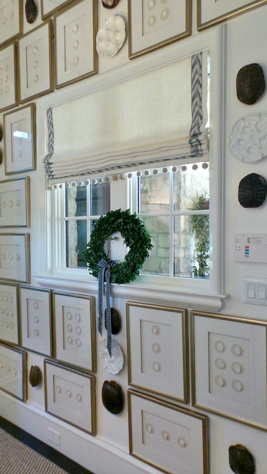
Designer/ Heather Hogan Roberts, Ivy & Vine-Photo/ Vicki Gladle Bolick
A Collected wall. Frames unify and the addition of shells adds organic contrast.
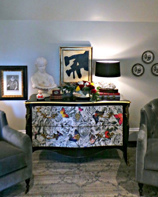
Designers/ Steve McKenzie’s -Photo/ Vicki Gladle Bolick
This chest was one of the most talked about pieces on the upper level. An on-trend piece functioned as a piece of artwork and gave the appearance of one-of-a-kind. Steve McKenzie is a well-known artist and his thoughtfully curated art groupings were displayed throughout the rear stair hall.
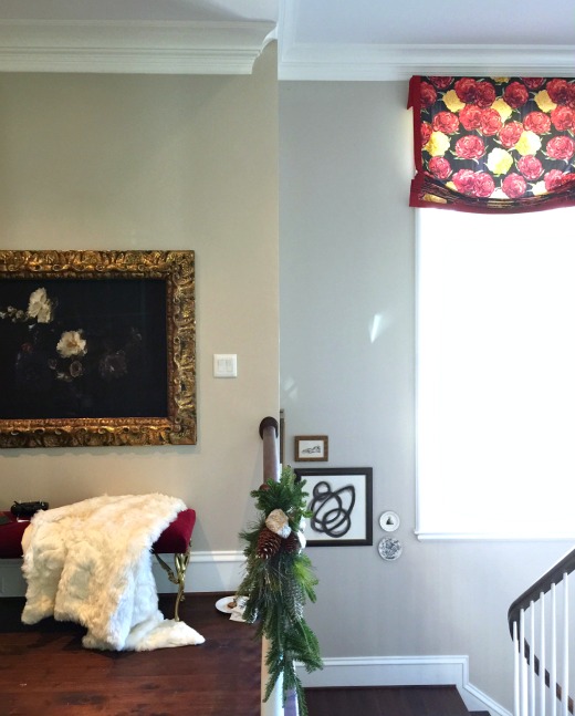
Designer/ Steve McKenzie’s-Photo/ Vicki Gladle Bolick
The larger piece of artwork in the stairwell is an original piece of artwork by Steve McKenzie, I loved the mix of angles with the circular lines of the offset plates. The fabric on the window shade is printed from one of Steve’s original works of art.
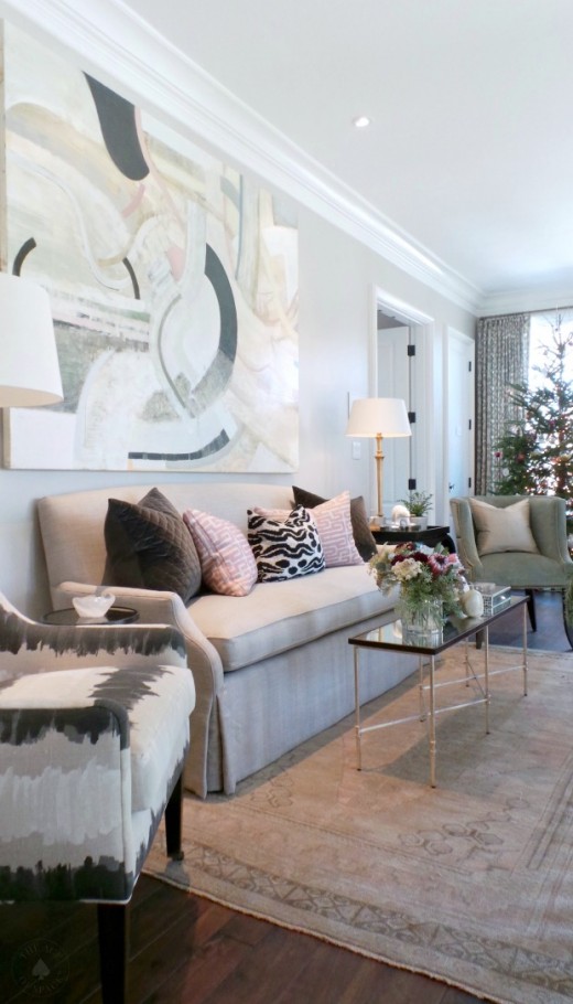
Designer/ Judy Bentley, Interior Views-Photo/ Vicki Gladle BolickT
Traditional pieces contrasted with abstract patterns gives this seating area an unexpected twist.
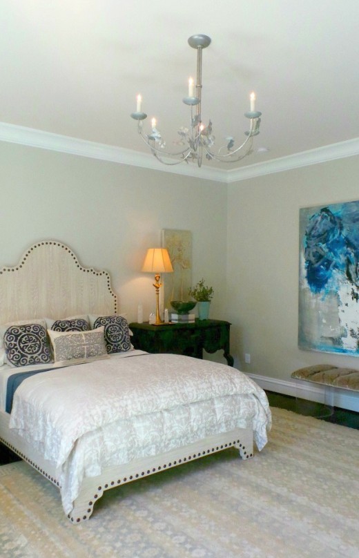
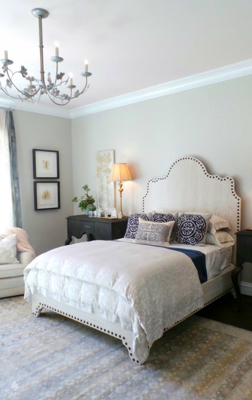
Designer/ Tish Mills-Harmonious Living-Photo/ Vicki Gladle Bolick
Tish’s bedroom space is the pure definition of “stylishly serene.” The soft palette skillfully layered with subtle patterns.
Designer/ Tish Mills, Harmonious Living-Photo/ Vicki Gladle Bolick
A custom bed centers the space with it’s sumptuous bedding, the perfect blend of pattern and texture. I loved the curved lines & oversized nailhead detailing. Of course, the rug is simply divine isn’t it?
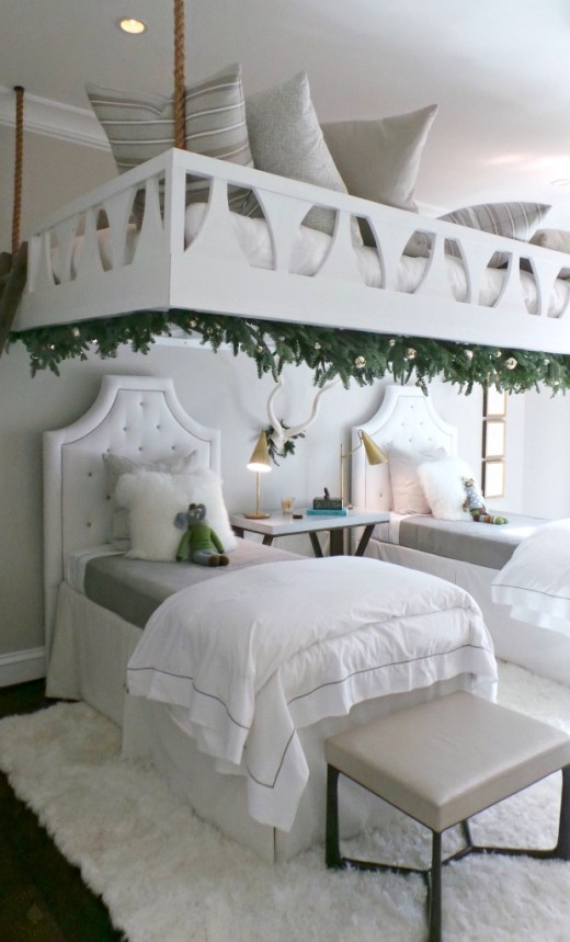
Designer/ Melanie Millner-Photo/ Vicki Gladle Bolick
A confection in white. A loft bed with unique cutout detail is suspended from the ceiling via rope. An all white palette is given relief with layers upon layers of texture. The bedroom was both sophisticated, whimsical & breath-taking.
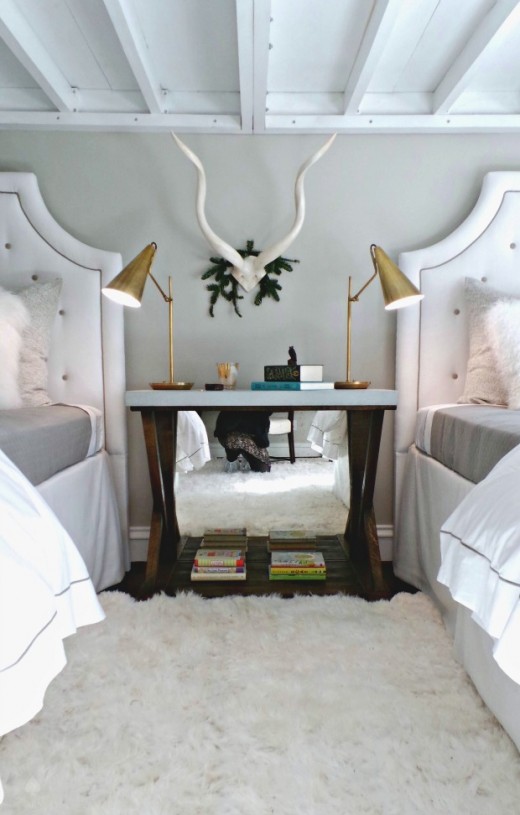
Designer/ Melanie Millner-Photo/ Vicki Gladle Bolick
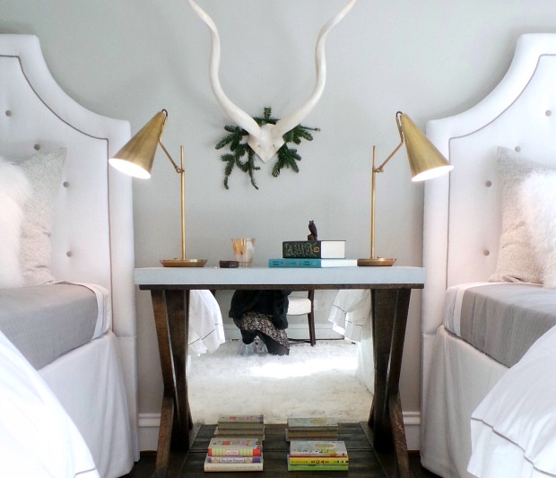
The beam detail provided architectural interest, and accessories such as the ceramic deer head (with a hint of Christmas) was one of many unexpected elements in this space.
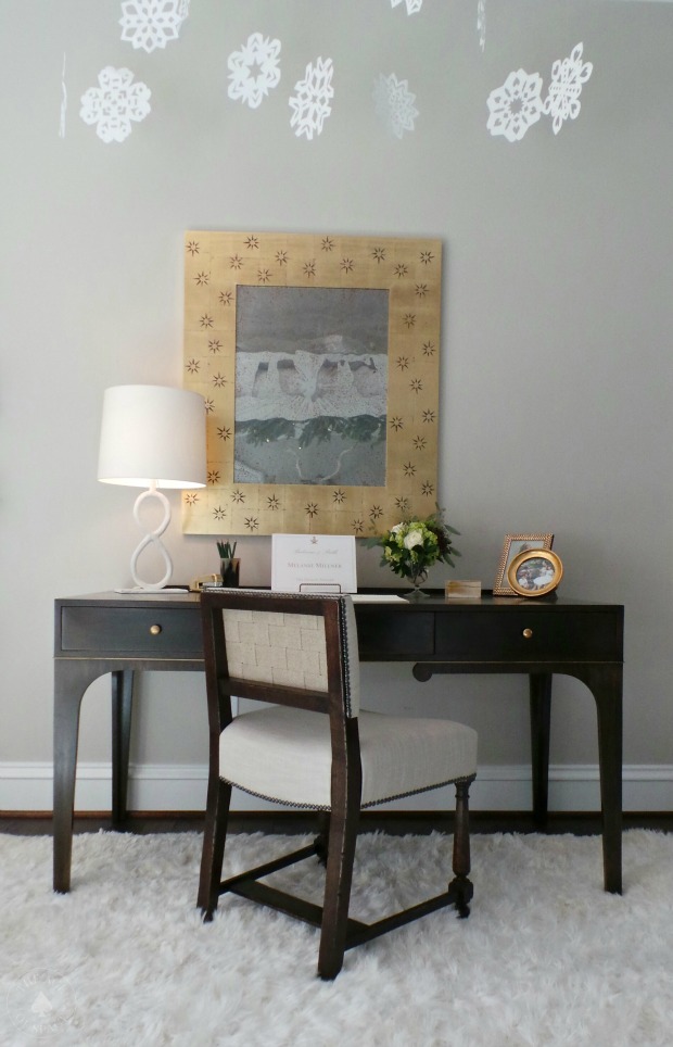
Designer/ Melanie Millner-Photo/ Vicki Gladle Bolick
Every space needs a stylish desk. Notice how the artwork is hung off-center, I love the unexpected…
This incredible Showhouse is open until December 13, 2015. You can find out more by visiting atlantaholidayhome.com
As always don’t forget to follow us on Social for inspiration and happenings.
Until next time,
BE INSPIRED. BE AMAZED.

