I waited a full 48 hours to let Marsala “breath” before I voiced an opinion on the “Color of the Year.” I had gotten a heads-up a few days ago, so I had time to consider my feelings about Pantone’s intriguing choice. At first I was a little shocked, what about blue? Did they get the year wrong, a misprint? Did someone confuse 2015 with 1960? I thought it was going to be a deep shade of blue. My favorite color.
So I was sitting pretty until Monday, and then an email came. As a well-known prankster, I was convinced that one of my design contemporaries had decided it was payback time. Until Tuesday, when I knew that it wasn’t just a bad joke. I thought about this color, which reminded me of Molly Ringwald’s Karmann Ghia in “Pretty In Pink,” (I still dream of that car). Then I came to the realization, is Marsala really that bad? I think not, once the initial shock wore off I find myself a little giddy with excitement. Let’s face it, we are over Griege, Beige, and Sage. Tones of reddish, brown have been around for a while, we just didn’t put a label on it. I like wine and I like Marsala. I’m going to like it as a shade of lipstick, a nail color, and truth be told, I’ve already snuck a few pillows and a throw into our ” Safari Chic” family room. It pairs well with deeper more rich shades, and frankly I’ve caught myself daydreaming about a luxurious sofa covered in Marsala crushed velvet, or as an accent wall. It’s growing on me.
Before we hold our ground and refuse to budge on this color that is muddying the waters of design, let’s give it a chance. Here’re some reasons why you should:
1) It won’t show dirt.
2) You can spill wine on it, and who will know?
3) Your grandmother will love it; seriously she will, and also she can have a nice little trip down memory lane. Free of charge.
4) It gives us something to debate in the world of interior design; we haven’t been this fired up since Restoration Hardware sent out a 15 pound stack of catalogs. You couldn’t even kick them to the curb…literally.
5) The color makes us look good. It does…Marsala lipstick in warm shades of reddish brown? Enough said.
So before we decide it’s not for us, let’s just give it a little chance. We forgave Restoration Hardware didn’t we?
Here are some of my favorite images showcasing the latest “Color of the Year…”
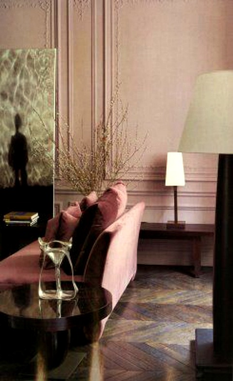
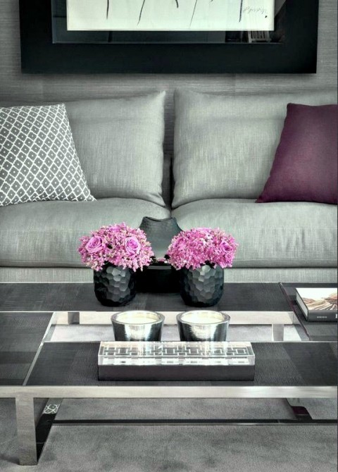
via Studio Annette-Romeo Sozzi
I can’t imagine the sofa in any other colour…
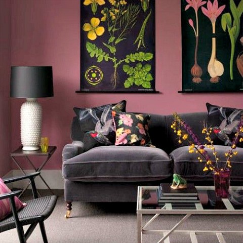
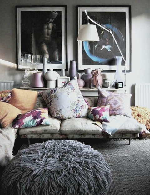
via confettigarden.com
The pairing of Marsala with deeper shades of grey creates depth and dimension…
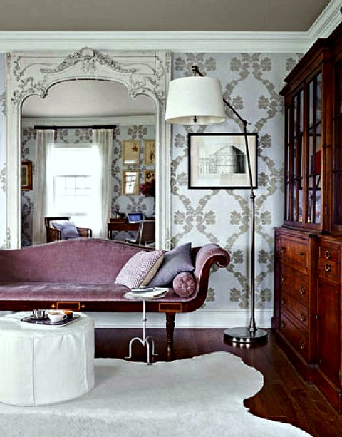
via Popassadico
Rich & luxe pairings of Marsala & Greys..
Via Elle Decor
Even in pattern I think this rich tone of reddish brown is going to bring much needed depth to design.
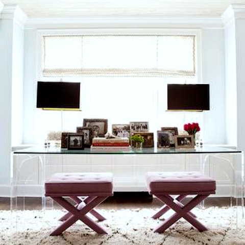
via Capella Kinchloe
Well known designers have knowingly used shades of Marsala, what’s not to love?
via Lily Bunn
Even young designers have found a way to incorporate vintage-y shades of Marsala…
Maybe you’ll reconsider the use of Pantone’s Color of the Year, I know I have. As always, don’t forget to follow us on Instagram, Facebook, Pinterest, Twitter & Google+ for more design inspiration & happenings.
Until next time,
BE INSPIRED. BE AMAZED.